Content from Introduction to R
Last updated on 2025-07-01 | Edit this page
Estimated time: 40 minutes
Authors: Maria Doyle, Jessica Chung, Vicky Perreau, Kim-Anh Lê Cao, Saritha Kodikara, Eva Hamrud.
Overview
Questions
- Why might you prefer to run code in a script rather than directly from the console?
- What is the assignment operator and how can you use it to store objects?
Objectives
- Introduce the R programming language and RStudio
- Explain functions, objects, and packages
- Demonstrate how to view help pages and documentation
R for Biologists course
R takes time to learn, like a spoken language. No one can expect to be an R expert after learning R for a few hours. This course has been designed to introduce biologists to R, showing some basics, and also some powerful things R can do (things that would be more difficult to do with Excel). The aim is to give beginners the confidence to continue learning R, so the focus here is on tidyverse and visualisation of biological data, as we believe this is a productive and engaging way to start learning R. After this short introduction you could use this book to dive a bit deeper.
Most R programmers do not remember all the command lines we share in this document. R is a language that is continuously evolving. They use Google extensively to use many new tricks. Do not hesitate to do the same!
Intro to R and RStudio
RStudio is an interface that makes it easier to use R. There are four panels in RStudio. The screenshot below shows an analogy linking the different RStudio panels to cooking.
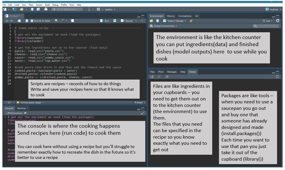
R script vs console
There are two ways to work in RStudio in the console or in a script.
Let’s start by running a command in the console.
Your turn 1.1
Run the command below in the console.
R
1 + 1
Once you’ve typed in the command into your console, just press enter. The output should be printed into the console.
Alternatively, we can use an R script. An R script allows us to have a record (recipe) of what we have done, whilst commands we type into the console are not saved. Keeping a record speeds up our analysis because we can re-use code, its also helpful to remember what we have done before!
Your turn 1.2
Create a script from the top menu in RStudio:File > New File > R Script, then type the command
below in your new script.
R
2 + 2
To run a command in a script, we place the cursor on the line you want to run, and then either:
- Click on the
runbutton on top of the panel - Use Ctrl + Enter (Windows/Linux) or Cmd + Enter (MacOS).
You can also highlight multiple lines at once and run them at once - have a go!
Recommended Practice: Use Scripts
The console is great for quick tests or running single lines of code. However, for more complex analyses, using scripts is best practice. Scripts help keep your work organized and reproducible. We’ll use scripts for the rest of this workshop.
Commenting
Comments are notes to ourself or others about the commands in the
script. They are useful also when you share code with others. Comments
start with a # which tells R not to run them as
commands.
R
# testing R
2 + 2
Keeping an accurate record of how you have manipulated your data is important for reproducible research. Writing detailed comments and documenting your work are useful reminders to your future self (and anyone else reading your scripts) on what your code does.
Commenting code is good practice, why not try commenting on the code you write in this session to get into the habit, it will also make your R script more informative when you come back to it in the future.
Working directory
Opening an RStudio session launches it from a specific location. This is the ‘working directory’.
Understanding the Working Directory
The working directory is the folder where R reads and saves files on your computer. When working in R, you’ll often read data files and write outputs like analysis results or plots. Knowing where your working directory is set helps ensure R finds your files and saves outputs in the right place.
You can find out where your current working directory is set to by using two different approaches:
- Run the command
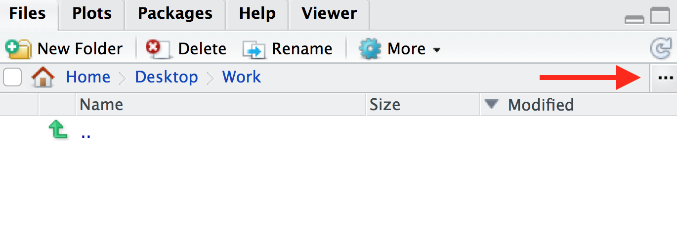
getwd(). This will print out the path to your working directory in the console. It will be in this format:/path/to/working/directory(Mac) orC:\path\to\working\directory(Windows), or - In the bottom-right panel, click the blue cog icon on the menu at
the top, then click
Go To Working Directory. This will show you the location and files in your working directory in the files window.
Your turn 1.3
Where is you working directory set to at the moment? Is this a useful place to have it set?
By default the working directory is often your home directory. To keep data and scripts organised its good practice to set your working directory as a specific folder.
Your turn 1.4
Create a folder for this course somewhere on your computer. Name the
folder something meaningful, for example, intro_r_course or
Introduction_to_R. Then, to set this folder as your working
directory, you can do this in multiple ways, e.g.:
- Click in the menu at the top on
Session > Set Working Directory > Choose directoryand choose your folder, or - In the bottom-right panel, navigate to the folder that you want to
be your working directory. You can also do this by clicking on the three
dots icon on the top-right of the panel. Then once you’re in a suitable
directory, in the menu bar of the in the bottom-right panel, navigate to
the blue cog icon and click
Set As Working Directory
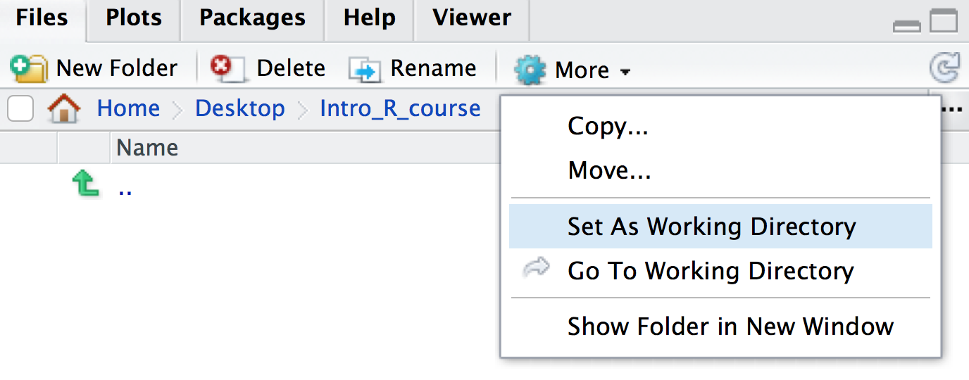
You will see that once you have set your working directory, the files inside your new folder will appear in the ‘Files’ window on RStudio.
Your turn 1.5
Save the script you created in the previous section as
intro.R in this directory. You can do this by clicking on
File > Save and the default location should be the
current working directory (e.g. intro_r_course).
Multiple Ways to Achieve the Same Goal in R
You might have noticed by now that in R, there are often several ways to accomplish the same task. You might find one method more intuitive or easier to use than others — and that’s okay! Experiment, explore, and choose the approach that works best for you.
You might have noticed that when you set your working directory in
the previous step, a line appeared in your console saying something like
setwd("~/Desktop/intro_r_course"). As well as the
point-and-click methods described above, you can also set your working
directory using the setwd() command in the console or in a
script.
Your turn 1.6
What might be an advantage of using the command line option
(i.e. setwd()) over point-and-click methods to set your
working directory?
There is no easy way to record what you point and click on (unless you write it all down!). Putting a command at the top of the script means you are less likely to forget where you have your working directory, and when you come back to it another day you can quickly re-run it.
Your turn 1.6 (continued)
Add a line at the top of your newly created script
intro.R so that the working directory is set to your newly
made folder (e.g. intro_r_course).
You can also use RStudio projects as described here to automatically keep track of and set the working directory.
Functions
In mathematics, a function defines a relation between inputs and output. In R (and other coding languages) it is the same. A function (also called a command) takes inputs called arguments inside parentheses, and output some results.
We have actually already used two functions in this workshop -
getwd() and setwd(). getwd() does
not take an input, but outputs your working directory.
setwd() takes a path as its input, and sets it as your
working directory.
Let’s take a look at some more functions below.
Your turn 1.7
Compare these two outputs. In the second line we use the function
sum().
R
2 + 2
sum(2, 2)
Your turn 1.8
Try using the below function with different inputs, what does it do?
R
sqrt(9)
sqrt(81)
Tab completion
A very useful feature is Tab completion. You can start typing and use Tab to autocomplete code, for example, a function name.
Objects
It is useful to store data or results so that we can use them later
on for other parts of the analysis. To do this, we can store data as
objects. We can use the assignment operator
<-, where the name of the object (which are called
variables) is on the left side of the arrow, and the
data you want to store is on the right side.
For example, the below code assigns the number 5 to the
object x using the <- operator. You can
print out what the x object is by just typing it into the
console or running it in your script.
Your turn 1.9
Play around and create some objects. Then print out the objects using their names.
R
x <- 5
x

result_1 <- 2 + 2
result_1
Assignment operator shortcut
In RStudio, typing Alt + - (holding down
Alt at the same time as the - key) will write
<- in a single keystroke in Windows, while typing >
Option + - (holding down Option at the
same time as the - key) does the same in a Mac.
Once you have assigned objects, you can perform manipulations on them using functions.
Your turn 1.10
Compare the two outputs.
R
sum(1, 2)

x <- 1
y <- 2
sum(x, y)
Remember, if you use the same object name multiple times, R will overwrite the previous object you had created.
Your turn 1.11
What is the value of x after running this code?
R
x <- 5
x <- 10
x is 10. The previous value of 5 has been
overwritten.
Your turn 1.12
Can you write some code to calculate the sum of the square root of 9 and the square root of 16?
R
sum(sqrt(9), sqrt(16))
OUTPUT
[1] 7Recommended Practice: Name your objects with care
Use clear and descriptive names for your objects, such as
data_raw and data_normalised, instead of vague
names like data1 and data2. This makes it
easier to track different steps in your analysis.
So far we have looked at objects which are numbers. However objects
can also be made of characters, these are called strings. To
create a string you need to use quotation marks "".
R
my_string <- "Hello!"
my_string
OUTPUT
[1] "Hello!"There are a whole host of different objects you can make in R, too
many to cover in this session! Later on when we do some data wrangling
we will work with objects which are dataframes (i.e. tables)
and vectors (a series of numbers and/or strings). Let’s make a
simple vector now to get familiar. To make a vector you need to use the
command c().
R
my_vector <- c(1, 2, 3)
my_vector
OUTPUT
[1] 1 2 3R
my_new_vector <- c("Hello", "World")
my_new_vector
OUTPUT
[1] "Hello" "World"Your turn 1.13
Try making an object and setting it as 1:5, what does
this object look like?
R
x <- 1:5
x
OUTPUT
[1] 1 2 3 4 51:5 creates a vector with a sequence of numbers from 1
to 5.
Once you have a vector, you can subset it. We will cover this further when we do some data wrangling but lets try a simple example here.
R
my_vector <- c("A", "B", "C")
# extract the first element from the vector
my_vector[1]
OUTPUT
[1] "A"R
# extract the last element from the vector
my_vector[3]
OUTPUT
[1] "C"Your turn 1.14
Create a vector from 1 to 10 and print the 9th element of the vector.
R
my_vector <- 1:10
my_vector[9]
OUTPUT
[1] 9Packages
We have seen that functions are really useful tools which can be used
to manipulate data. Although some basic functions, like
sum() and setwd() are available by default
when you install R, some more exciting functions are not. There are
thousands of R functions available for you to use, and functions are
organised into groups called packages or libraries. An
R package contains a collection of functions (usually that perform
related tasks), as well as documentation to explain how to use the
functions. Packages are made by R developers who wish to share their
methods with others.
Once we have identified a package we want to use, we can install and
load it so we can use it. Here we will use the tidyverse
package which includes lots of useful functions for data managing, we
will use the package later in this session.
If it’s not already installed on your computer, you can use the
install.packages function to install a
package. A package is a collection of functions along
with documentation, code, tests and example data.
R
install.packages("tidyverse")
Packages in the CRAN or Bioconductor
Packages are hosted in different locations. Packages hosted on CRAN (stands for Comprehensive R Archive Network) are often generic package for all sorts of data and analysis. Bioconductor is an ecosystem that hosts packages specifically dedicated to biological data.
The installation of packages from Bioconductor is a bit different,
e.g to install the mixOmics package we type:
R
# You don't need to run this codeblock for this workshop

if (!require("BiocManager", quietly = TRUE))
    install.packages("BiocManager")

BiocManager::install("mixOmics")
You don’t need to remember this command line, as it is featured in the Bioconductor package page (see here for example).
One advantage of Bioconductor packages is that they are well documented, updated and maintained every six months.
Getting help
As described above, every R package includes documentation to explain
how to use functions. For example, to find out what a function in R
does, type a ? before the name and help information will
appear in the Help panel on the right in RStudio.
Your turn 1.15
Find out what the sum() command does.
R
?sum
What is really important is to scroll down the examples to understand how the function can be used in practice. You can use this command line to run the examples:
Your turn 1.16
Run some examples of the sum() command.
R
example(sum)
Packages also come with more comprehensive documentation called vignettes. These are really helpful to get you started with the package and identify which functions you might want to use.
Your turn 1.17
Have a look at the tidyverse package vignette.
R
browseVignettes("tidyverse")
Common R errors
R error messages are common and often cryptic. You most likely will encounter at least one error message during this tutorial. Some common reasons for errors are:
- Case sensitivity. In R, as in other programming languages, case
sensitivity is important.
?install.packagesis different to?Install.packages. - Missing commas
- Mismatched parentheses or brackets or unclosed parentheses, brackets or apostrophes
- Not quoting file paths (
"") - When a command line is unfinished, the “+” in the console will indicate it is awaiting further instructions. Press ESC to cancel the command.
To see examples of some R error messages with explanations see here
More information for when you get stuck
As well as using package vignettes and documentation, Google and Stack Overflow are also useful resources for getting help.
Key Points
- Use scripts for analyses over typing commands in the console. This allows you to keep an accurate record of what you did, which is important for reproducible research
- You can store data as objects using the assignment operator
<- - Installing packages from CRAN is done with the
install.packages()function - You can view the help page of a function by typing a
?before the name (e.g.?sum)
Content from Exploring the Data
Last updated on 2025-07-01 | Edit this page
Estimated time: 40 minutes
Overview
Questions
- How can I load data from CSV or TSV files into R?
- What are some functions in R that can be used to examine the data?
Objectives
- Load in our RNA-seq data files into R
- Try using some functions to explore data frames (tables) in R
- Learn how to subset parts of a data frame
Getting started with the data
In this tutorial, we will learn some R through creating plots to visualise data from an RNA-seq experiment.
The GREIN platform (GEO RNA-seq Experiments Interactive Navigator) provides >6,500 published datasets from GEO that have been uniformly processed. It is available at http://www.ilincs.org/apps/grein/. You can search for a dataset of interest using the GEO code. GREIN provide QC metrics for the RNA-seq datasets and both raw and normalized counts. We will use the normalized counts here. These are the counts of reads for each gene for each sample normalized for differences in sequencing depth and composition bias. Generally, the higher the number of counts the more the gene is expressed.
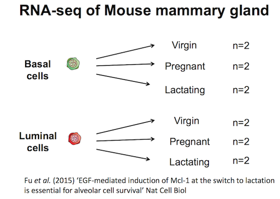
RNA-seq dataset from Fu et al.
Here we will create some plots using RNA-seq data from the paper by Fu et al. 2015 (GEO accession number GSE60450). Mice, like all mammals, have mammary glands which produce milk to nourish their young. The authors of this study were interested in examining how the mammary epithelium (which line the mammary glands) expands and develops during pregnancy and lactation.
This study examined expression in basal and luminal cells from mice at different stages (virgin, pregnant and lactating). Basal cells are mammary stem cells and luminal cells secrete milk. There are 2 samples per group and 6 groups, so 12 samples in total.
Tidyverse

The tidyverse package that we installed previously is a
collection of R packages that includes the extremely widely used
ggplot2 package.
The tidyverse makes data science faster, easier and more fun.
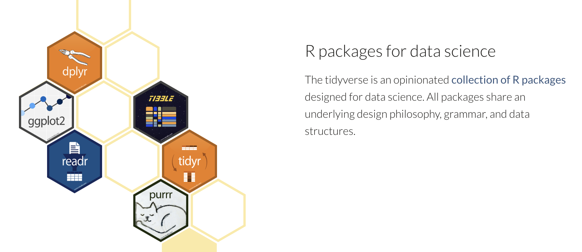
Tidyverse is built on the principle of organizing data in a tidy format.
Data files
Your turn 2.1
If you haven’t already downloaded the data.zip file for this workshop, you can click here to download it now.
Unzip the file and store the extracted data folder in
your working directory.
Make sure the data is in the correct directory
Inside your current working directory directory
(e.g. intro_r_course), there should be a directory called
data and inside that directory should be two CSV files.
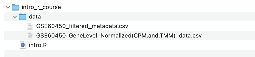
In the next section, you will load these files into R using the file path (i.e. where they are located in the filesystem), so the code in this tutorial expects the files to be in the above location. If you have the files in a different location, you also have the option of changing the commands in the following sections to match where the files are located on your computer.
Loading the data
We use library() to load in the packages that we need.
As described in the cooking analogy in the first screenshot,
install.packages() is like buying a saucepan,
library() is taking it out of the cupboard to use it.
Your turn 2.2
Load in the tidyverse package using the library()
function:
R
library(tidyverse)
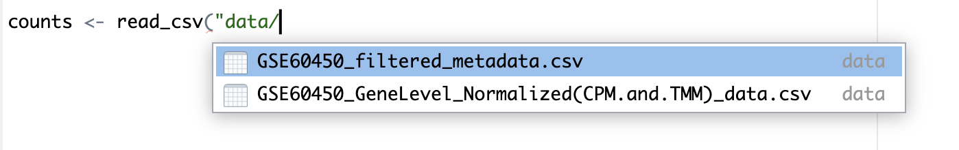
The files we will use are CSV comma-separated, so we will use the
read_csv() function from the tidyverse. There is also a
read_tsv() function for tab-separated values.
We will use the counts file called
GSE60450_GeneLevel_Normalized(CPM.and.TMM)_data.csv that’s
in a folder called data i.e. the path to the file should be
data/GSE60450_GeneLevel_Normalized(CPM.and.TMM)_data.csv.
We can read the counts file into R with the command below. We’ll
store the contents of the counts file in an object
called counts. This stores the file contents in R’s memory
making it easier to use.
Your turn 2.3
Load the count data into R. We will store the contents of the counts
file in an object called counts. Note that
we need to put quotes (““) around file paths.
R
# Read in counts file
counts <- read_csv("data/GSE60450_GeneLevel_Normalized(CPM.and.TMM)_data.csv")
OUTPUT
New names:
Rows: 23735 Columns: 14
── Column specification
──────────────────────────────────────────────────────── Delimiter: "," chr
(2): ...1, gene_symbol dbl (12): GSM1480291, GSM1480292, GSM1480293,
GSM1480294, GSM1480295, GSM148...
ℹ Use `spec()` to retrieve the full column specification for this data. ℹ
Specify the column types or set `show_col_types = FALSE` to quiet this message.
• `` -> `...1`
Note: In R, structured tables like these are called data frames.
Tab completion for file paths
We mentioned tab completion in the previous section, but tab completion can also complete file paths. This means you don’t have to type out the long filenames in the codeblock above, but instead, begin to type out a few characters, then press tab and see the autocompletion options.
No need to be overwhelmed by the outputs! It contains information
regarding “column specification” (telling us that there is a missing
column name in the header and it has been filled with the name “…1”,
which is how read_csv handles missing column names by default). We will
fix this later. It also tells us what data types read_csv
is detecting in each column. Columns with text characters have been
detected (col_character) and also columns with numbers
(col_double). We won’t get into the details of R data types
in this tutorial but they are important to know when you get more
proficient in R. You can read more about them in the R
for Data Science book.
Your turn 2.4
Load the sample information data into R. We will store the contents
of this file in an object called sampleinfo.
R
# Read in metadata
sampleinfo <- read_csv("data/GSE60450_filtered_metadata.csv")
OUTPUT
New names:
Rows: 12 Columns: 4
── Column specification
──────────────────────────────────────────────────────── Delimiter: "," chr
(4): ...1, characteristics, immunophenotype, developmental stage
ℹ Use `spec()` to retrieve the full column specification for this data. ℹ
Specify the column types or set `show_col_types = FALSE` to quiet this message.
• `` -> `...1`
It is very common when looking at biological data that you have two
types of data. One is the actual data (in this case, our
counts object, which has the expression values of different
genes in each sample). The other is metadata
i.e. information about our samples (in this case, our
sampleinfo object includes information about whether
samples are from basal or luminal cells and whether the cells were from
mice which are virgin/pregnant/lactating, etc.)
What data have we imported into R?
To summarise, we have imported two data frames (i.e. tables) into R:
-
countsobject is our gene expression data -
sampleinfoobject is our sample metadata
Your turn 2.5
Let’s get used to making some mistakes in R, so we know what errors look like and how to handle them.
Test what happens if you type
Library(tidyverse)
What is wrong and how would you fix it?Test what happens if you type
library(tidyverse
What is wrong and how would you fix it?Test what happens if you type
read_tsv("data/GSE60450_filtered_metadata.csv")
What is wrong and how would you fix it?Test what happens if you type
read_csv("data/GSE60450_filtered_metadata.csv)
What is wrong and how would you fix it?Test what happens if you type
read_csv("GSE60450_filtered_metadata.csv")
What is wrong and how would you fix it?
Don’t forget you can press ESC to escape the current command and start a new prompt.
Getting to know the data
When assigning a value to an object, R does not print the value. We
do not see what is in counts or sampleinfo.
But there are ways we can look at the data.
Your turn 2.6
Click on the sampleinfo object in your global
environment panel on the right-hand-side of RStudio. This will open a
new tab.
This is the equivalent of using the View() function.
e.g.
R
View(sampleinfo)
Your turn 2.7
Type the name of the object and this will print the first few lines and some information, such as number of rows. Note that this is similar to how we looked at the value of objects we assigned in the previous section.
R
sampleinfo
OUTPUT
# A tibble: 12 × 4
   ...1       characteristics              immunophenotype `developmental stage`
   <chr>      <chr>                        <chr>           <chr>
 1 GSM1480291 mammary gland, luminal cell… luminal cell p… virgin
 2 GSM1480292 mammary gland, luminal cell… luminal cell p… virgin
 3 GSM1480293 mammary gland, luminal cell… luminal cell p… 18.5 day pregnancy
 4 GSM1480294 mammary gland, luminal cell… luminal cell p… 18.5 day pregnancy
 5 GSM1480295 mammary gland, luminal cell… luminal cell p… 2 day lactation
 6 GSM1480296 mammary gland, luminal cell… luminal cell p… 2 day lactation
 7 GSM1480297 mammary gland, basal cells,… basal cell pop… virgin
 8 GSM1480298 mammary gland, basal cells,… basal cell pop… virgin
 9 GSM1480299 mammary gland, basal cells,… basal cell pop… 18.5 day pregnancy
10 GSM1480300 mammary gland, basal cells,… basal cell pop… 18.5 day pregnancy
11 GSM1480301 mammary gland, basal cells,… basal cell pop… 2 day lactation
12 GSM1480302 mammary gland, basal cells,… basal cell pop… 2 day lactation
We can also take a look the first few lines with head().
This shows us the first 6 lines.
Your turn 2.8
Use head() to look at the first few lines of
counts.
R
head(counts)
OUTPUT
# A tibble: 6 × 14
  ...1        gene_symbol GSM1480291 GSM1480292 GSM1480293 GSM1480294 GSM1480295
  <chr>       <chr>            <dbl>      <dbl>      <dbl>      <dbl>      <dbl>
1 ENSMUSG000… Gnai3          243.      256.         240.       217.       84.7
2 ENSMUSG000… Pbsn             0         0            0          0         0
3 ENSMUSG000… Cdc45           11.2      13.8         11.6        4.27      8.35
4 ENSMUSG000… H19              6.31      8.53         7.09      11.0       0.194
5 ENSMUSG000… Scml2            2.19      4.66         2.80       2.50      1.24
6 ENSMUSG000… Apoh             0.224     0.0840       0          0         0
# ℹ 7 more variables: GSM1480296 <dbl>, GSM1480297 <dbl>, GSM1480298 <dbl>,
#   GSM1480299 <dbl>, GSM1480300 <dbl>, GSM1480301 <dbl>, GSM1480302 <dbl>
We can also look at the last few lines with tail(). This
shows us the last 6 lines. This can be useful to check the bottom of the
file, that it looks ok.
Your turn 2.6
Use tail() to look at the last few lines of
counts.
R
tail(counts)
OUTPUT
# A tibble: 6 × 14
  ...1        gene_symbol GSM1480291 GSM1480292 GSM1480293 GSM1480294 GSM1480295
  <chr>       <chr>            <dbl>      <dbl>      <dbl>      <dbl>      <dbl>
1 ENSMUSG000… Pcdha7           0.134     0          0            0          0
2 ENSMUSG000… Gm34240          0         0          0            0          0
3 ENSMUSG000… Pcdhga3          0.582     2.27       0.334        1.10       0
4 ENSMUSG000… Gm20750          0         0.0840     0.0417       0          0
5 ENSMUSG000… Rhbg             5.28      4.96       6.26         3.98       1.01
6 ENSMUSG000… Mat2a          212.      225.        97.9         70.1       22.0
# ℹ 7 more variables: GSM1480296 <dbl>, GSM1480297 <dbl>, GSM1480298 <dbl>,
#   GSM1480299 <dbl>, GSM1480300 <dbl>, GSM1480301 <dbl>, GSM1480302 <dbl>
Your turn 2.7
What are the cell types of the first 6 samples in the metadata for the Fu et al. 2015 experiment?
R
head(sampleinfo)
OUTPUT
# A tibble: 6 × 4
  ...1       characteristics               immunophenotype `developmental stage`
  <chr>      <chr>                         <chr>           <chr>
1 GSM1480291 mammary gland, luminal cells… luminal cell p… virgin
2 GSM1480292 mammary gland, luminal cells… luminal cell p… virgin
3 GSM1480293 mammary gland, luminal cells… luminal cell p… 18.5 day pregnancy
4 GSM1480294 mammary gland, luminal cells… luminal cell p… 18.5 day pregnancy
5 GSM1480295 mammary gland, luminal cells… luminal cell p… 2 day lactation
6 GSM1480296 mammary gland, luminal cells… luminal cell p… 2 day lactation
The first 6 samples are luminal cells.
Dimensions of the data
You can print the number of rows and columns using the function
dim().
For example:
R
dim(sampleinfo)
OUTPUT
[1] 12 4sampleinfo has 12 rows, corresponding to our 12 samples,
and 4 columns, corresponding to different features about the
samples.
Tip: Always Verify Your Data Size
Double-check that your data has the expected number of rows and columns. It’s easy to read the wrong file or encounter corrupted downloads. Catching these issues early will save you a lot of trouble later!
Your turn 2.8
Check how many rows and columns are in counts. Do these
numbers match what we expected?
R
dim(counts)
OUTPUT
[1] 23735 14We know that there are 12 samples in our data (see the diagram above), and we don’t know how many genes were measured.
Rows: 23735. This means there are 23735 genes, which could be correct (we didn’t know how many genes were measured).
Columns: 14. We would expect to have 12 columns
corresponding to our 12 samples, but instead we have 14. Why is this?
Have a look back at when we visualised the counts data,
there are two extra columns in the data corresponding to gene IDs and
gene names.
In the Environment Tab in the top right panel in RStudio we can also see the number of rows and columns in the objects we have in our session.
Column and row names of the data
Your turn 2.9
Check the column and row names used in in sampleinfo
R
colnames(sampleinfo)
rownames(sampleinfo)
Subsetting
Subsetting is very useful tool in R which allows you to extract parts of the data you want to analyse. There are multiple ways to subset data and here we’ll only cover a few.
We can use the $ operator to access individual columns
by name.
Your turn 2.10
Extract the ‘immunophenotype’ column of the metadata.
R
sampleinfo$immunophenotype
We can also use square brackets [ ] to access the rows
and columns of a matrix or a table.
For example, we can extract the first row ‘1’ of the data, using the number on the left-hand-side of the comma.
Your turn 2.11
Extract the first row using square brackets.
R
sampleinfo[1,]
Here we extract the second column ‘2’ of the data, as indicated on the right-hand-side of the comma.
Your turn 2.12
Extract the second column using square brackets.
R
sampleinfo[,2]
You can use a combination of number of row and column to extract one element in the matrix.
Your turn 2.13
Extract the element in the first row and second column.
R
sampleinfo[1,2]
Your turn 2.14
We can also subset using a range of numbers. For example, if we
wanted the first three rows of sampleinfo
R
sampleinfo[1:3,]
Or if we wanted the 2nd, 4th, and 5th row:
R
sampleinfo[c(2,4,5),]
The c() function
We use the c() function extremely often in R when we
have multiple items that we are combining (‘c’ stands for
concatenating). We will see it again in this tutorial.
Renaming column names
In the previous section, when we loaded in the data from the csv file, we noticed that the first column had a missing column name and by default, read_csv function assigned a name of “...1” to it. Let’s change this column to something more descriptive now. We can do this by combining a few things we’ve just learnt.
Your turn 2.15
First, we use the colnames() function to obtain the
column names of sampleinfo. Then we use square brackets to subset the
first value of the column names ([1]). Last, we use the
assignment operator (<-) to set the new value of the
first column name to “sample_id”.
R
colnames(sampleinfo)[1] <- "sample_id"
Let’s check if this has been changed correctly.
R
sampleinfo
OUTPUT
# A tibble: 12 × 4
   sample_id  characteristics              immunophenotype `developmental stage`
   <chr>      <chr>                        <chr>           <chr>
 1 GSM1480291 mammary gland, luminal cell… luminal cell p… virgin
 2 GSM1480292 mammary gland, luminal cell… luminal cell p… virgin
 3 GSM1480293 mammary gland, luminal cell… luminal cell p… 18.5 day pregnancy
 4 GSM1480294 mammary gland, luminal cell… luminal cell p… 18.5 day pregnancy
 5 GSM1480295 mammary gland, luminal cell… luminal cell p… 2 day lactation
 6 GSM1480296 mammary gland, luminal cell… luminal cell p… 2 day lactation
 7 GSM1480297 mammary gland, basal cells,… basal cell pop… virgin
 8 GSM1480298 mammary gland, basal cells,… basal cell pop… virgin
 9 GSM1480299 mammary gland, basal cells,… basal cell pop… 18.5 day pregnancy
10 GSM1480300 mammary gland, basal cells,… basal cell pop… 18.5 day pregnancy
11 GSM1480301 mammary gland, basal cells,… basal cell pop… 2 day lactation
12 GSM1480302 mammary gland, basal cells,… basal cell pop… 2 day lactation
The first column is now named “sample_id”.
We can also do the same to the counts data. This time, we rename the first column name from “...1” to “gene_id”.
Your turn 2.16
R
colnames(counts)[1] <- "gene_id"
Note: there are multiple ways to rename columns. We’ve covered one
way here, but another way is using the rename() function.
When programming, you’ll often find many ways to do the same thing.
Often there is one obvious method depending on the context you’re
in.
Structure and Summary
Other useful commands for checking data are str() and
summary().
str() shows us the structure of our data. It shows us
what columns there are, the first few entries, and what data type they
are e.g. character or numbers (double or integer).
R
str(sampleinfo)
OUTPUT
spc_tbl_ [12 × 4] (S3: spec_tbl_df/tbl_df/tbl/data.frame)
 $ sample_id          : chr [1:12] "GSM1480291" "GSM1480292" "GSM1480293" "GSM1480294" ...
 $ characteristics    : chr [1:12] "mammary gland, luminal cells, virgin" "mammary gland, luminal cells, virgin" "mammary gland, luminal cells, 18.5 day pregnancy" "mammary gland, luminal cells, 18.5 day pregnancy" ...
 $ immunophenotype    : chr [1:12] "luminal cell population" "luminal cell population" "luminal cell population" "luminal cell population" ...
 $ developmental stage: chr [1:12] "virgin" "virgin" "18.5 day pregnancy" "18.5 day pregnancy" ...
 - attr(*, "spec")=
  .. cols(
  ..   ...1 = col_character(),
  ..   characteristics = col_character(),
  ..   immunophenotype = col_character(),
  ..   `developmental stage` = col_character()
  .. )
 - attr(*, "problems")=<externalptr>
summary() generates summary statistics of our data. For
numeric columns (columns of type double or integer) it outputs
statistics such as the min, max, mean and median. We will demonstrate
this with the counts file as it contains numeric data. For character
columns it shows us the length (how many rows).
R
summary(counts)
OUTPUT
   gene_id          gene_symbol          GSM1480291          GSM1480292
 Length:23735       Length:23735       Min.   :    0.000   Min.   :    0.000
 Class :character   Class :character   1st Qu.:    0.000   1st Qu.:    0.000
 Mode  :character   Mode  :character   Median :    1.745   Median :    1.891
                                       Mean   :   42.132   Mean   :   42.132
                                       3rd Qu.:   29.840   3rd Qu.:   29.604
                                       Max.   :12525.066   Max.   :12416.211
   GSM1480293          GSM1480294          GSM1480295
 Min.   :    0.000   Min.   :    0.000   Min.   :0.000e+00
 1st Qu.:    0.000   1st Qu.:    0.000   1st Qu.:0.000e+00
 Median :    0.918   Median :    0.888   Median :5.830e-01
 Mean   :   42.132   Mean   :   42.132   Mean   :4.213e+01
 3rd Qu.:   21.908   3rd Qu.:   19.921   3rd Qu.:1.227e+01
 Max.   :49191.148   Max.   :55692.086   Max.   :1.119e+05
   GSM1480296          GSM1480297          GSM1480298
 Min.   :0.000e+00   Min.   :    0.000   Min.   :    0.000
 1st Qu.:0.000e+00   1st Qu.:    0.000   1st Qu.:    0.000
 Median :5.440e-01   Median :    2.158   Median :    2.254
 Mean   :4.213e+01   Mean   :   42.132   Mean   :   42.132
 3rd Qu.:1.228e+01   3rd Qu.:   27.414   3rd Qu.:   26.450
 Max.   :1.087e+05   Max.   :10489.311   Max.   :10662.486
   GSM1480299          GSM1480300          GSM1480301
 Min.   :    0.000   Min.   :    0.000   Min.   :    0.000
 1st Qu.:    0.000   1st Qu.:    0.000   1st Qu.:    0.000
 Median :    1.854   Median :    1.816   Median :    1.629
 Mean   :   42.132   Mean   :   42.132   Mean   :   42.132
 3rd Qu.:   24.860   3rd Qu.:   23.443   3rd Qu.:   23.444
 Max.   :15194.048   Max.   :17434.935   Max.   :19152.728
   GSM1480302
 Min.   :    0.000
 1st Qu.:    0.000
 Median :    1.749
 Mean   :   42.132
 3rd Qu.:   24.818
 Max.   :15997.193
Key Points
- The
read_csv()andread_tsv()functions can be used to load in CSV and TSV files in R - The
head()andtail()functions can print the first and last parts of an object and thedim()function prints the dimensions of an object - Subsetting can be done with the
$operator using column names or using square brackets[ ] - The
str()andsummary()functions are useful functions to get an overview or summary of the data
Content from Formatting the Data
Last updated on 2025-07-01 | Edit this page
Estimated time: 20 minutes
Overview
Questions
- What do the
pivot_longer()andfull_join()functions do?
Objectives
- Explore how to convert data frames from wide to long format
- Join two data frames using column names
Converting from wide to long format
We will first convert the data from wide format into long format to
make it easier to work with and so that we can plot the data with the
ggplot2 package.
Instead of multiple columns with counts for each sample, we just want one column containing all the expression values, as shown below:
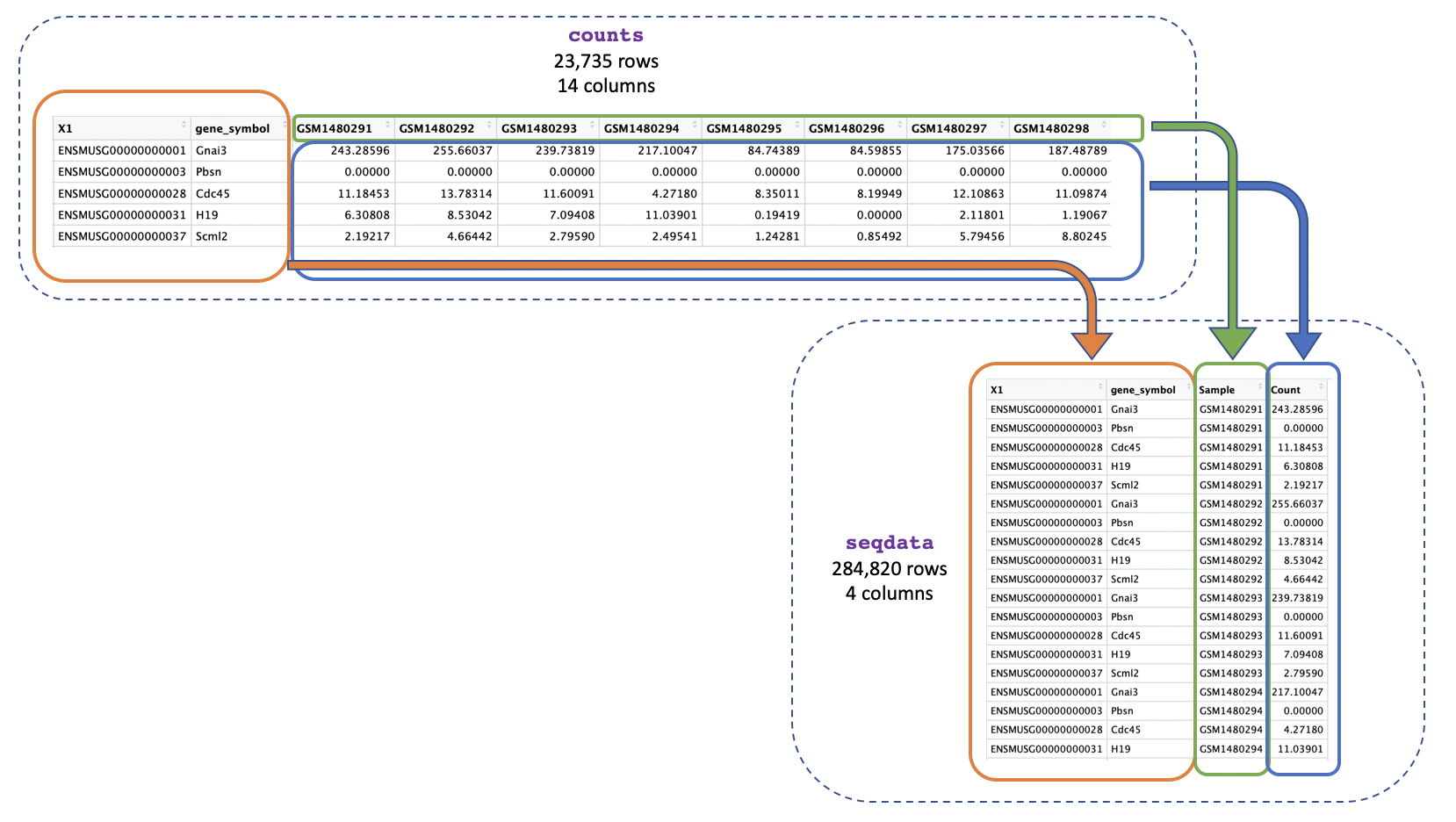
We can use pivot_longer() to easily change the format
into long format.
Your turn 3.1
Find out what pivot_longer() does and how to use it
R
?pivot_longer
Your turn 3.2
Convert the counts data into long format and save it as a new object
called seqdata
R
seqdata <- pivot_longer(counts, cols = starts_with("GSM"),
                        names_to = "Sample", values_to = "Count")
We use cols = starts_with("GSM") to tell the function we
want to reformat the columns whose names start with “GSM” (these columns
are the ones where we have the gene counts). pivot_longer()
will then reformat the specified columns into two new columns, which
we’re naming “Sample” and “Count”. The names_to = "Sample"
specifies that we want the new column containing the columns to be named
“Sample”, and the values_to = "Count" specifies that we
want the new column containing the values to be named “Count”.
As explained earlier, in R there is often more than one way to do the
same thing. We could get the same result by specifying the argument
cols in a different way. For example, instead of using
starts_with we could use a range like the one you used in
the previous section.
Your turn 3.3
Convert the counts data into long format using a column range
R
seqdata <- pivot_longer(counts, cols = GSM1480291:GSM1480302,
                        names_to = "Sample", values_to = "Count")
Another way we could do the same thing is by specifying the columns
we do not want to reformat, this will tell
pivot_longer() to reformat all the other columns. To do
that we put a minus sign “-” in front of the column
names that we don’t want to reformat. This is a pretty common way to use
pivot_longer() as sometimes it is easier to exclude columns
we don’t want than include columns we do. The command below would give
us the same result as the previous command.
Your turn 3.4
Convert the counts data into long format by specifying which columns not to convert
R
seqdata <- pivot_longer(counts, cols = -c("gene_id", "gene_symbol"),
                        names_to = "Sample", values_to = "Count")
Your turn 3.5
Type each command line above, then look at the data, are all three of
the seqdata objects you made the same?
All three seqdata objects are the same, as we did the
same conversion from wide to long format using 3 different methods.
seqdata has 284820 rows and 4 columns, and has length
4.
Joining two tables
Now that we’ve got just one column containing sample IDs in both our counts and metadata objects we can join them together using the sample IDs. This will make it easier to identify the categories for each sample (e.g. if it’s basal cell type) and to use that information in our plots.
We use the function full_join() and give as arguments
the two tables we want to join. We add
by = join_by(Sample == sample_id) to say we want to join on
the column called “Sample” in the first table (seqdata) and
the column called “sample_id” in the second table
(sampleinfo) when the values match:
Your turn 3.6
Join the count data and metadata by matching sample IDs
R
allinfo <- full_join(seqdata, sampleinfo, by = join_by(Sample == sample_id))
Your turn 3.7
Have a look at the new object you generated above and see what information it includes, how many columns does it have and what does each column tell you?
R
dim(allinfo)
OUTPUT
[1] 284820 7R
colnames(allinfo)
OUTPUT
[1] "gene_id"             "gene_symbol"         "Sample"
[4] "Count"               "characteristics"     "immunophenotype"
[7] "developmental stage"
The allinfo object has 7 columns which tell you about
the gene id and symbol, the same id, gene count, and sample information
(characteristics, immunophenotype, and developmental stage).
Key Points
- The
pivot_longer()function can convert data frames from wide to long format and there are multiple ways to do this - The
full_join()function can merge two data frames. You can specify which column names should be joined by using thejoin_by()function.
Content from Introduction to ggplot2
Last updated on 2025-07-01 | Edit this page
Estimated time: 30 minutes
Overview
Questions
- What are the three components needed for creating a plot in ggplot2?
Objectives
- Explain how to plot a basic plot in ggplot2
- Learn how to modify plots using colours and facets
Plotting with ggplot2
ggplot2 is a plotting package that
makes it simple to create complex plots. One really great advantage
compared to classic R packages is that we only need to make minimal
changes if the underlying data change or if we decide to change our plot
type, for example, from a box plot to a violin plot. This helps in
creating publication quality plots with minimal amounts of adjustments
and tweaking.
ggplot2 likes data in the ‘long’
format, i.e., a column for every variable, and a row for every
observation, similar to what we created with pivot_longer()
above. Well-structured data will save you lots of time when making
figures with ggplot2.
Understanding ggplot2 Architecture
ggplot2 plots are built step by step by adding layers with
+. This approach provides great flexibility, allowing you
to customize your plots extensively.
To build a ggplot, we use the following basic template that can be used for different types of plots. Three things are required for a ggplot:
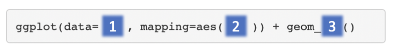
- The data
- The columns in the data we want to map to visual properties (called
aesthetics or
aes) e.g. the columns for x values, y values and colours - The type of plot (the
geom_)
There are different geoms we can use to create different types of
plot e.g. geom_line() geom_point(),
geom_boxplot(). To see the geoms available take a look at
the ggplot2 help or the handy ggplot2
cheatsheet. Or if you type “geom” in RStudio, RStudio will show you
the different types of geoms you can use.
Creating a boxplot
Let’s plot boxplots to visualise the distribution of the counts for each sample. This helps us to compare the samples and check if any look unusual.
Note: In commands that span multiple lines in R, “+” must go at the end of the line—it can’t go at the beginning.
Your turn 4.1
Run the following command line. Identify the key functions
aes and type of plot:
R
ggplot(data = allinfo, mapping = aes(x = Sample, y = Count)) +
  geom_boxplot()
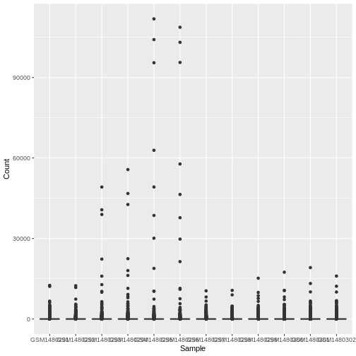
This plot looks a bit weird. It’s because we have some genes with
extremely high counts. To make it easier to visualise the distributions
we usually plot the logarithm of RNA-seq counts. We’ll plot the Sample
on the X axis and log2 Counts on the y axis. We can log the Counts
within the aes(). The sample labels are also overlapping
each other, we will show how to fix this later.
Your turn 4.2
Generate a boxplot of log2 gene counts
R
ggplot(data = allinfo, mapping = aes(x = Sample, y = log2(Count))) +
  geom_boxplot()
WARNING
Warning: Removed 84054 rows containing non-finite outside the scale range
(`stat_boxplot()`).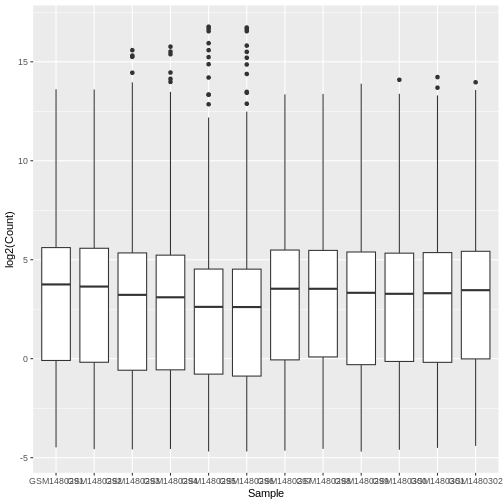
We get a warning here about rows containing non-finite values being removed. This is because some of the genes have a count of zero in the samples and a log of zero is undefined. We can add +1 to every count to avoid the zeros being dropped (‘psuedo-count’).
Your turn 4.3
Generate a boxplot of log2 gene counts + 1
R
ggplot(data = allinfo, mapping = aes(x = Sample, y = log2(Count + 1))) +
  geom_boxplot()
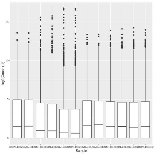
The box plots show that the distributions of the samples are not identical but they are not very different.
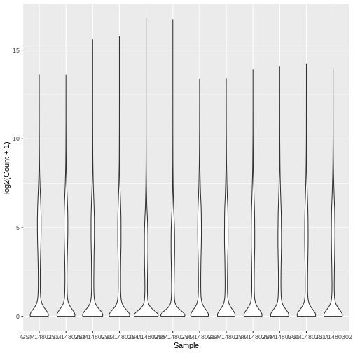
Violin plot
Boxplots are useful summaries, but hide the shape of the distribution. For example, if the distribution is bimodal, we would not see it in a boxplot. An alternative to the boxplot is the violin plot, where the shape (of the density of points) is drawn.
Let’s choose a different geom to do another type of plot.
Your turn 4.4
Using the same data (same x and y values), try editing the code above
to make a violin plot using the geom_violin() function.
R
# Plotting a violin plot
ggplot(data = allinfo, mapping = aes(x = Sample, y = log2(Count + 1))) +
  geom_violin()
Colouring by categories
Let’s add a different colour for each sample.
Your turn 4.5
View the help file for geom_boxplot and scroll down to
Aesthetics heading. It specifies that there is an
option for colour.
Your turn 4.6
Map each sample to a colour using the colour = argument.
As we are mapping colour to a column in our data we need to put this
inside aes().
R
ggplot(data = allinfo, mapping = aes(x = Sample, y = log2(Count + 1), colour = Sample)) +
  geom_boxplot()
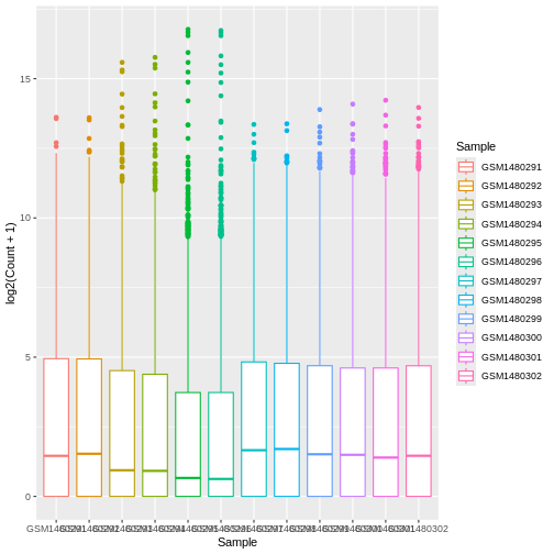
Colouring the edges wasn’t quite what we had in mind. Look at the
help for geom_boxplot to see what other aesthetic we could
use. Let’s try fill = instead.
Your turn 4.7
Map each sample to a colour using the fill =
argument.
R
ggplot(data = allinfo, mapping = aes(x = Sample, y = log2(Count + 1), fill = Sample)) +
  geom_boxplot()
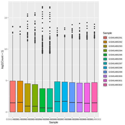
That looks better. fill = is used to fill in areas in
ggplot2 plots, whereas colour = is used to colour lines and
points.
A really nice feature about ggplot is that we can easily colour by
another variable by simply changing the column we give to
fill =.
Creating subplots for each gene using faceting
With ggplot we can easily make subplots using faceting. For example we can make stripcharts. These are a type of scatterplot and are useful when there are a small number of samples (when there are not too many points to visualise). Here we will make stripcharts plotting expression by the groups (basal virgin, basal pregnant, basal lactating, luminal virgin, luminal pregnant, luminal lactating) for each gene.
Shorter category names
As we saw in question 5.5, our column names are quite long, and this
might make them difficult to visualise on a plot. We can use the
function mutate() to add another column to our
allinfo object with shorter group names.
Your turn 4.8
Make a new column in allinfo with shortened category
names using the below code. How has the object allinfo
changed?
R
allinfo <- mutate(allinfo, Group = case_when(
        str_detect(characteristics, "basal.*virgin") ~  "bvirg",
        str_detect(characteristics, "basal.*preg")  ~  "bpreg",
        str_detect(characteristics, "basal.*lact")  ~  "blact",
        str_detect(characteristics, "luminal.*virgin")  ~  "lvirg",
        str_detect(characteristics, "luminal.*preg")  ~  "lpreg",
        str_detect(characteristics, "luminal.*lact")  ~  "llact"
       ))
Note: While not covered in this workshop, the above code uses regular expressions to match patterns of characters in a string.
R
head(allinfo)
OUTPUT
# A tibble: 6 × 8
  gene_id            gene_symbol Sample    Count characteristics immunophenotype
  <chr>              <chr>       <chr>     <dbl> <chr>           <chr>
1 ENSMUSG00000000001 Gnai3       GSM14802… 243.  mammary gland,… luminal cell p…
2 ENSMUSG00000000001 Gnai3       GSM14802… 256.  mammary gland,… luminal cell p…
3 ENSMUSG00000000001 Gnai3       GSM14802… 240.  mammary gland,… luminal cell p…
4 ENSMUSG00000000001 Gnai3       GSM14802… 217.  mammary gland,… luminal cell p…
5 ENSMUSG00000000001 Gnai3       GSM14802…  84.7 mammary gland,… luminal cell p…
6 ENSMUSG00000000001 Gnai3       GSM14802…  84.6 mammary gland,… luminal cell p…
# ℹ 2 more variables: `developmental stage` <chr>, Group <chr>
We observe a new column called Group at the end which
has shortened category names, bvirg, lpreg, etc.
Filter for genes of interest
Your turn 4.9
How many genes are there in our data?
R
dim(counts)
OUTPUT
[1] 23735 14There are 23735 rows in our original counts data, so we have data on
23735 different genes. Note: we didn’t run dim() on our
allinfo object because this has multiple rows per gene.
Like our data set, most RNA-seq data sets have information on thousands of genes, but most of them are usually not very interesting, so we may want to filter them.
Here, we choose 8 genes with the highest counts summed across all samples. They are listed here.
Your turn 4.10
Create an object with a list of the 8 most highly expressed genes
R
mygenes <- c("Csn1s2a", "Csn1s1", "Csn2", "Glycam1", "COX1", "Trf", "Wap", "Eef1a1")
We filter our data for just these genes of interest. We use
%in% to check if a value is in a set of values.
Filter the counts data to only include genes in the
mygenes object
R
mygenes_counts <- filter(allinfo, gene_symbol %in% mygenes)
Your turn 4.11
Can you figure out how many rows mygenes_counts will
have without inspecting the object? Print the dimensions of the object
to check if you’re right.
There is one row per sample per gene in mygenes_counts
(as is the case in allinfo). As there are 8 genes left
after filtering, and 12 samples in our data, we expect there to be 96
rows in mygenes_counts.
R
# We expect there to be 8 x 12 rows in mygenes_counts
8 * 12
OUTPUT
[1] 96R
# That is correct!
dim(mygenes_counts)
OUTPUT
[1] 96 8To identify these 8 genes, we used pipes (%>%)
to string a series of function calls together (which is beyond the scope
of this tutorial, but totally worth learning about independently!).
mygenes <- allinfo %>%
  group_by(gene_symbol) %>%
  summarise(Total_count = sum(Count)) %>%
  arrange(desc(Total_count)) %>%
  head(n = 8) %>%
  pull(gene_symbol)
Faceting
Your turn 4.12
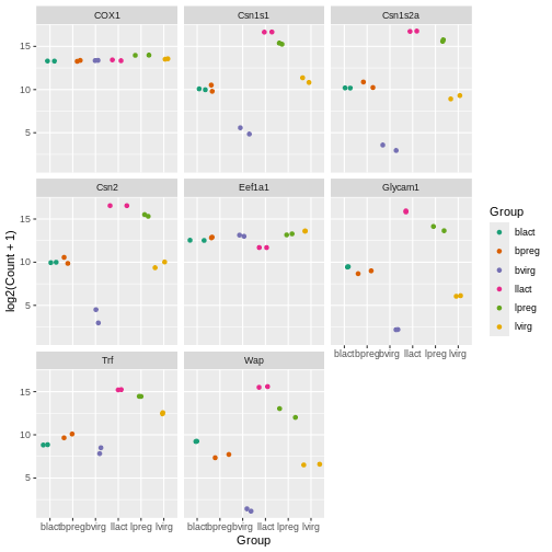
Make boxplots faceted by gene, grouped and coloured by groups
R
ggplot(data = mygenes_counts,
       mapping = aes(x = Group, y = log2(Count + 1), fill = Group)) +
  geom_boxplot() +
  facet_wrap(~ gene_symbol)
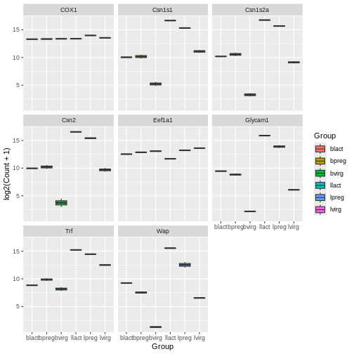
Here we facet on the gene_symbol column using
facet_wrap(). We add the tilde symbol ~ in
front of the column we want to facet on.
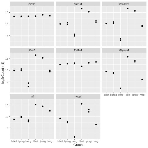
Scatterplots
In the example over, boxplots are not suitable because we only have
two values per group. Let’s plot the individual points instead using the
geom_point() to make a scatter plot.
Your turn 4.13
Make scatter plots faceted by gene and grouped by groups
R
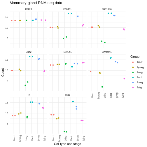
ggplot(data = mygenes_counts, mapping = aes(x = Group, y = log2(Count + 1))) +
  geom_point() +
  facet_wrap(~ gene_symbol)
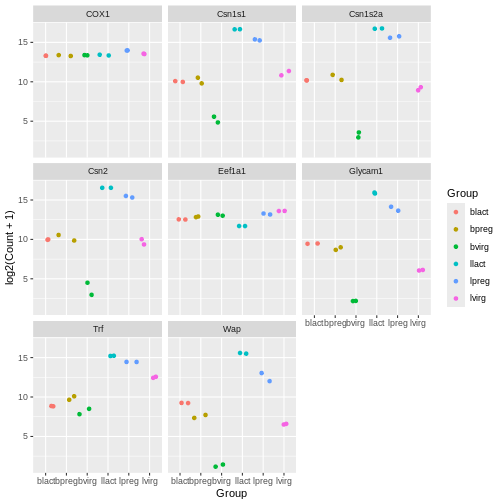
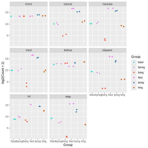
Jitter plot
In the previous plots, the points are overlapping which makes it hard
to see them. We can make a jitter plot using geom_jitter()
which adds a small amount of random variation to the location of each
point so they do not overlap. If is also quite common to combine jitter
plots with other types of plot, for example, jitter
with boxplot.
Your turn 4.14
Make jitter plots faceted by gene and grouped by groups
R
ggplot(data = mygenes_counts, mapping = aes(x = Group, y = log2(Count + 1))) +
  geom_jitter() +
  facet_wrap(~ gene_symbol)

Your turn 4.15
Modify the code above to colour the jitter plots by group
R
ggplot(data = mygenes_counts,
       mapping = aes(x = Group, y = log2(Count + 1), colour = Group)) +
  geom_jitter() +
  facet_wrap(~ gene_symbol)
Note that for jitter plots you will want to use the
colour = slot rather than the fill = slot.
Key Points
- A ggplot has 3 components: data (dataset), mapping (columns to plot)
and geom (type of plot). Different types of plots include
geom_point(),geom_jitter(),geom_line(),geom_boxplot(),geom_violin(). -
facet_wrap()can be used to make subplots of the data - The aesthetics of a ggplot can be modified, such as colouring by different columns in the dataset
Content from Extra ggplot2 Customisation
Last updated on 2025-07-01 | Edit this page
Estimated time: 20 minutes
Overview
Questions
- How can you add a title and change the axis labels in a ggplot?
Objectives
- Understand how to specify colours of a plot, either manually or by using a predefined palette
- Explore modifying the
theme()function in ggplot to adjust plot aesthetics
This chapter can be skipped if running low on time.
Specifying colours
You might want to control plotting colours. To see what colour names
are available you can type colours(). There is also an R
colours cheatsheet that shows what the colours look like.
R
mycolours <- c("turquoise", "plum", "tomato", "violet", "steelblue", "chocolate")
Then we then add these colours to the plot using a + and
scale_colour_manual(values = mycolours).
R
ggplot(data = mygenes_counts,
       mapping = aes(x = Group, y = log2(Count + 1), colour = Group)) +
  geom_jitter() +
  facet_wrap(~ gene_symbol) +
  scale_colour_manual(values = mycolours)
There are built-in colour palettes that can be handy to use, where
the sets of colours are predefined. scale_colour_brewer()
is a popular one (there is also scale_fill_brewer()). You
can take a look at the help for scale_colour_brewer() to
see what palettes are available. The R
colours cheatsheet also shows what the colours of the palettes look
like. There’s one called “Dark2”, let’s have a look at that.
R
ggplot(data = mygenes_counts,
       mapping = aes(x = Group, y = log2(Count + 1), colour = Group)) +
  geom_jitter() +
  facet_wrap(~ gene_symbol) +
  scale_colour_brewer(palette = "Dark2")
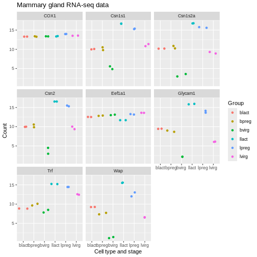
Axis labels and Title
We can change the axis labels and add a title with
labs(). To change the x axis label we use
labs(x = "New name"). To change the y axis label we use
labs(y = "New name") or we can change them all at the same
time.
R
ggplot(data = mygenes_counts,
       mapping = aes(x = Group, y = log2(Count + 1), colour = Group)) +
  geom_jitter() +
  facet_wrap(~ gene_symbol) +
  labs(x = "Cell type and stage", y = "Count", title = "Mammary gland RNA-seq data")
Themes
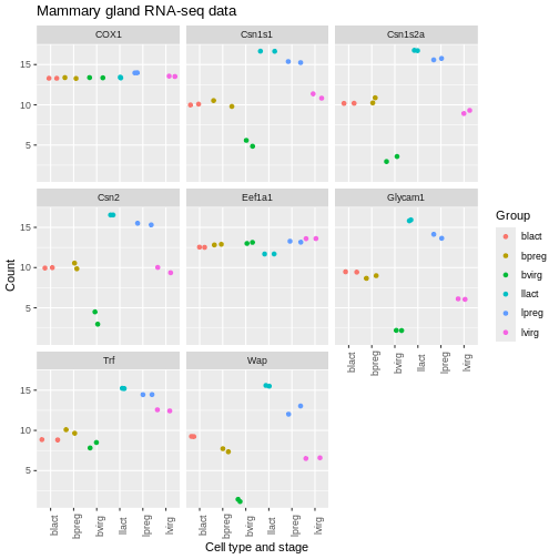
We can adjust the text on the x axis (the group labels) by turning them 90 degrees so we can read the labels better. To do this we modify the ggplot theme. Themes are the non-data parts of the plot.
R
ggplot(data = mygenes_counts,
       mapping = aes(x = Group, y = log2(Count + 1), colour = Group)) +
  geom_jitter() +
  facet_wrap(~ gene_symbol) +
  labs(x = "Cell type and stage", y = "Count", title = "Mammary gland RNA-seq data") +
  theme(axis.text.x = element_text(angle = 90))
We can remove the grey background and grid lines.
There are also a lot of built-in themes. Let’s have a look at a
couple of the more widely used themes. The default ggplot theme is
theme_grey().
R
ggplot(data = mygenes_counts,
       mapping = aes(x = Group, y = log2(Count + 1), colour = Group)) +
  geom_jitter() +
  facet_wrap(~ gene_symbol) +
  labs(x = "Cell type and stage", y = "Count", title = "Mammary gland RNA-seq data") +
  theme_bw() +
  theme(axis.text.x = element_text(angle = 90))
R
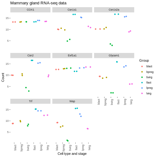
ggplot(data = mygenes_counts,
       mapping = aes(x = Group, y = log2(Count + 1), colour = Group)) +
  geom_jitter() +
  facet_wrap(~ gene_symbol) +
  labs(x = "Cell type and stage", y = "Count", title = "Mammary gland RNA-seq data") +
  theme_minimal() +
  theme(axis.text.x = element_text(angle = 90))
There are many themes available, you can see some in the R graph gallery.
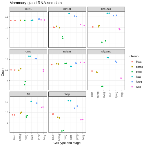
We can also modify parts of the theme individually. We can remove the grey background and grid lines with the code below.
R
ggplot(data = mygenes_counts,
       mapping = aes(x = Group, y = log2(Count + 1), colour = Group)) +
  geom_jitter() +
  facet_wrap(~ gene_symbol) +
  labs(x = "Cell type and stage", y = "Count", title = "Mammary gland RNA-seq data") +
  theme(axis.text.x = element_text(angle = 90)) +
  theme(panel.background = element_blank(),
        panel.grid.major = element_blank(),
        panel.grid.minor = element_blank())
Order of categories
The groups have been plotted in alphabetical order on the x axis and in the legend (that is the default order), however, we may want to change the order. We may prefer to plot the groups in order of stage, for example, basal virgin, basal pregnant, basal lactate, luminal virgin, luminal pregnant, luminal lactate.
First let’s make an object with the group order that we want.
R
group_order <- c("bvirg", "bpreg", "blact", "lvirg", "lpreg", "llact")
Next we need to make a column with the groups into an R data type called a factor. Factors in R are a special data type used to specify categories, you can read more about them in the R for Data Science book. The names of the categories are called the factor levels.
We’ll add another column called “Group_f” where we’ll make the Group column into a factor and specify what order we want the levels of the factor.
R
mygenes_counts <- mutate(mygenes_counts, Group_f = factor(Group, levels = group_order))
Take a look at the data. As the table is quite wide we can use
select() to select just the columns we want to view.
R
select(mygenes_counts, gene_id, Group, Group_f)
OUTPUT
# A tibble: 96 × 3
   gene_id            Group Group_f
   <chr>              <chr> <fct>
 1 ENSMUSG00000000381 lvirg lvirg
 2 ENSMUSG00000000381 lvirg lvirg
 3 ENSMUSG00000000381 lpreg lpreg
 4 ENSMUSG00000000381 lpreg lpreg
 5 ENSMUSG00000000381 llact llact
 6 ENSMUSG00000000381 llact llact
 7 ENSMUSG00000000381 bvirg bvirg
 8 ENSMUSG00000000381 bvirg bvirg
 9 ENSMUSG00000000381 bpreg bpreg
10 ENSMUSG00000000381 bpreg bpreg
# ℹ 86 more rows
Notice that the Group column has <chr> under the
heading, that indicates is a character data type, while the Group_f
column has <fct> under the heading, indicating it is
a factor data type. The str() command that we saw
previously is useful to check the data types in objects.
R
str(mygenes_counts)
OUTPUT
tibble [96 × 9] (S3: tbl_df/tbl/data.frame)
 $ gene_id            : chr [1:96] "ENSMUSG00000000381" "ENSMUSG00000000381" "ENSMUSG00000000381" "ENSMUSG00000000381" ...
 $ gene_symbol        : chr [1:96] "Wap" "Wap" "Wap" "Wap" ...
 $ Sample             : chr [1:96] "GSM1480291" "GSM1480292" "GSM1480293" "GSM1480294" ...
 $ Count              : num [1:96] 90.2 95.6 4140.3 8414.4 49204.9 ...
 $ characteristics    : chr [1:96] "mammary gland, luminal cells, virgin" "mammary gland, luminal cells, virgin" "mammary gland, luminal cells, 18.5 day pregnancy" "mammary gland, luminal cells, 18.5 day pregnancy" ...
 $ immunophenotype    : chr [1:96] "luminal cell population" "luminal cell population" "luminal cell population" "luminal cell population" ...
 $ developmental stage: chr [1:96] "virgin" "virgin" "18.5 day pregnancy" "18.5 day pregnancy" ...
 $ Group              : chr [1:96] "lvirg" "lvirg" "lpreg" "lpreg" ...
 $ Group_f            : Factor w/ 6 levels "bvirg","bpreg",..: 4 4 5 5 6 6 1 1 2 2 ...
str() shows us Group_f column is a Factor with 6 levels
(categories).
We can check the factor levels of a column as below.
R
levels(mygenes_counts$Group_f)
OUTPUT
[1] "bvirg" "bpreg" "blact" "lvirg" "lpreg" "llact"The levels are in the order that we want, so we can now change our
plot to use the “Group_f” column instead of Group column (change
x = and colour =).
R
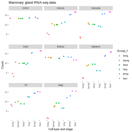
ggplot(data = mygenes_counts,
       mapping = aes(x = Group_f, y = log2(Count + 1), colour = Group_f)) +
  geom_jitter() +
  facet_wrap(~ gene_symbol) +
  labs(x = "Cell type and stage", y = "Count", title = "Mammary gland RNA-seq data") +
  theme(axis.text.x = element_text(angle = 90)) +
  theme(panel.background = element_blank(),
        panel.grid.major = element_blank(),
        panel.grid.minor = element_blank())
We could do similar if we wanted to have the genes in the facets in a different order. For example, we could add another column called “gene_symbol_f” where we make the gene_symbol column into a factor, specifying the order of the levels.
Exercise
Make a colourblind-friendly plot using the colourblind-friendly palettes here.
Key Points
- In
ggplot2, you can specify colours manually using thescale_colour_manual()function or use a predefined palette using thescale_colour_brewer()function - The
labs()function allows you to set a plot title and change axis labels - Complete themes such as
theme_bw()andtheme_classic()can be used to change the appearance of a plot - Using the
theme()function allows you to tweak components of a theme
Content from Wrapping Up
Last updated on 2025-07-01 | Edit this page
Estimated time: 20 minutes
Overview
Questions
- How can I save plots to a file?
Objectives
- Save plots to a pdf file in R
- Explain why using the
sessionInfo()function is good practice
Saving plots
We can save plots interactively by clicking Export in the Plots
window and saving as e.g. “myplot.pdf”. Or we can output plots to pdf
using pdf() followed by dev.off(). We put our
plot code after the call to pdf() and before closing the
plot device with dev.off().
Let’s save our last plot.
R
pdf("myplot.pdf")
ggplot(data = mygenes_counts,
       mapping = aes(x = Group_f, y = log2(Count + 1), colour = Group_f)) +
  geom_jitter() +
  facet_wrap(~ gene_symbol) +
  labs(x = "Cell type and stage", y = "Count", title = "Mammary gland RNA-seq data") +
  theme(axis.text.x = element_text(angle = 90)) +
  theme(panel.background = element_blank(),
        panel.grid.major = element_blank(),
        panel.grid.minor = element_blank())
dev.off()
Session Info
At the end of your report, we recommend you run the
sessionInfo() function which prints out details about your
working environment such as the version of R yo are running, loaded
packages, and package versions. Printing out sessionInfo()
at the end of your analysis is good practice as it helps with
reproducibility in the future.
R
sessionInfo()
OUTPUT
R version 4.5.1 (2025-06-13)
Platform: x86_64-pc-linux-gnu
Running under: Ubuntu 22.04.5 LTS

Matrix products: default
BLAS:   /usr/lib/x86_64-linux-gnu/blas/libblas.so.3.10.0
LAPACK: /usr/lib/x86_64-linux-gnu/lapack/liblapack.so.3.10.0  LAPACK version 3.10.0

locale:
 [1] LC_CTYPE=C.UTF-8       LC_NUMERIC=C           LC_TIME=C.UTF-8
 [4] LC_COLLATE=C.UTF-8     LC_MONETARY=C.UTF-8    LC_MESSAGES=C.UTF-8
 [7] LC_PAPER=C.UTF-8       LC_NAME=C              LC_ADDRESS=C
[10] LC_TELEPHONE=C         LC_MEASUREMENT=C.UTF-8 LC_IDENTIFICATION=C

time zone: UTC
tzcode source: system (glibc)

attached base packages:
[1] stats     graphics  grDevices utils     datasets  methods   base

other attached packages:
 [1] lubridate_1.9.4 forcats_1.0.0   stringr_1.5.1   dplyr_1.1.4
 [5] purrr_1.0.4     readr_2.1.5     tidyr_1.3.1     tibble_3.3.0
 [9] ggplot2_3.5.2   tidyverse_2.0.0

loaded via a namespace (and not attached):
 [1] vctrs_0.6.5        cli_3.6.5          knitr_1.50         rlang_1.1.6
 [5] xfun_0.52          stringi_1.8.7      renv_1.1.4         generics_0.1.4
 [9] glue_1.8.0         hms_1.1.3          scales_1.4.0       grid_4.5.1
[13] evaluate_1.0.4     tzdb_0.5.0         yaml_2.3.10        lifecycle_1.0.4
[17] compiler_4.5.1     RColorBrewer_1.1-3 timechange_0.3.0   pkgconfig_2.0.3
[21] farver_2.1.2       R6_2.6.1           tidyselect_1.2.1   pillar_1.10.2
[25] magrittr_2.0.3     tools_4.5.1        withr_3.0.2        gtable_0.3.6
Exercises
Exercise
- Download the raw counts for this dataset from GREIN.
- Make a boxplot. Do the samples look any different to the normalised counts?
- Make subplots for the same set of 8 genes. Do they look any different to the normalised counts?
- Download the normalised counts for the GSE63310 dataset from GREIN. Make boxplots colouring the samples using different columns in the metadata file.
Further Reading
Key Points
- You can use the
pdf()function to save plots, and finalize the file by callingdev.off() - The
sessionInfo()function prints information about your R environment which is useful for reproducibility