Introduction to ggplot2
Last updated on 2025-07-01 | Edit this page
Estimated time: 30 minutes
Overview
Questions
- What are the three components needed for creating a plot in ggplot2?
Objectives
- Explain how to plot a basic plot in ggplot2
- Learn how to modify plots using colours and facets
Plotting with ggplot2
ggplot2 is a plotting package that
makes it simple to create complex plots. One really great advantage
compared to classic R packages is that we only need to make minimal
changes if the underlying data change or if we decide to change our plot
type, for example, from a box plot to a violin plot. This helps in
creating publication quality plots with minimal amounts of adjustments
and tweaking.
ggplot2 likes data in the ‘long’
format, i.e., a column for every variable, and a row for every
observation, similar to what we created with pivot_longer()
above. Well-structured data will save you lots of time when making
figures with ggplot2.
Understanding ggplot2 Architecture
ggplot2 plots are built step by step by adding layers with
+. This approach provides great flexibility, allowing you
to customize your plots extensively.
To build a ggplot, we use the following basic template that can be used for different types of plots. Three things are required for a ggplot:
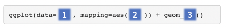
- The data
- The columns in the data we want to map to visual properties (called
aesthetics or
aes) e.g. the columns for x values, y values and colours - The type of plot (the
geom_)
There are different geoms we can use to create different types of
plot e.g. geom_line() geom_point(),
geom_boxplot(). To see the geoms available take a look at
the ggplot2 help or the handy ggplot2
cheatsheet. Or if you type “geom” in RStudio, RStudio will show you
the different types of geoms you can use.
Creating a boxplot
Let’s plot boxplots to visualise the distribution of the counts for each sample. This helps us to compare the samples and check if any look unusual.
Note: In commands that span multiple lines in R, “+” must go at the end of the line—it can’t go at the beginning.
Your turn 4.1
Run the following command line. Identify the key functions
aes and type of plot:
R
ggplot(data = allinfo, mapping = aes(x = Sample, y = Count)) +
  geom_boxplot()
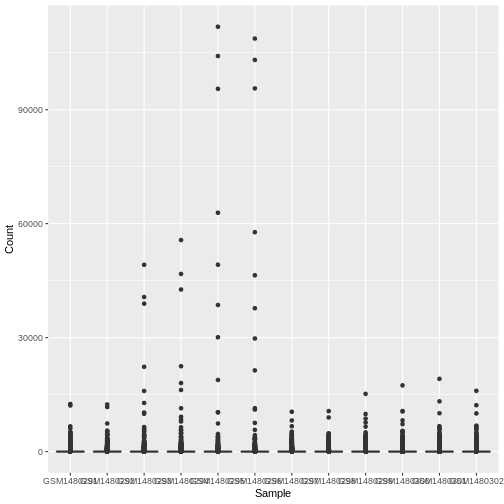
This plot looks a bit weird. It’s because we have some genes with
extremely high counts. To make it easier to visualise the distributions
we usually plot the logarithm of RNA-seq counts. We’ll plot the Sample
on the X axis and log2 Counts on the y axis. We can log the Counts
within the aes(). The sample labels are also overlapping
each other, we will show how to fix this later.
Your turn 4.2
Generate a boxplot of log2 gene counts
R
ggplot(data = allinfo, mapping = aes(x = Sample, y = log2(Count))) +
  geom_boxplot()
WARNING
Warning: Removed 84054 rows containing non-finite outside the scale range
(`stat_boxplot()`).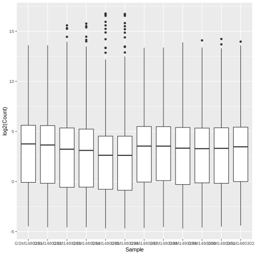
We get a warning here about rows containing non-finite values being removed. This is because some of the genes have a count of zero in the samples and a log of zero is undefined. We can add +1 to every count to avoid the zeros being dropped (‘psuedo-count’).
Your turn 4.3
Generate a boxplot of log2 gene counts + 1
R
ggplot(data = allinfo, mapping = aes(x = Sample, y = log2(Count + 1))) +
  geom_boxplot()
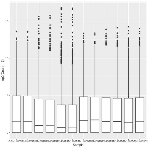
The box plots show that the distributions of the samples are not identical but they are not very different.
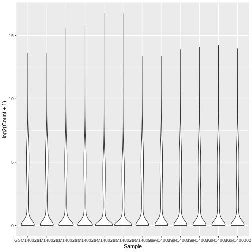
Violin plot
Boxplots are useful summaries, but hide the shape of the distribution. For example, if the distribution is bimodal, we would not see it in a boxplot. An alternative to the boxplot is the violin plot, where the shape (of the density of points) is drawn.
Let’s choose a different geom to do another type of plot.
Your turn 4.4
Using the same data (same x and y values), try editing the code above
to make a violin plot using the geom_violin() function.
R
# Plotting a violin plot
ggplot(data = allinfo, mapping = aes(x = Sample, y = log2(Count + 1))) +
  geom_violin()
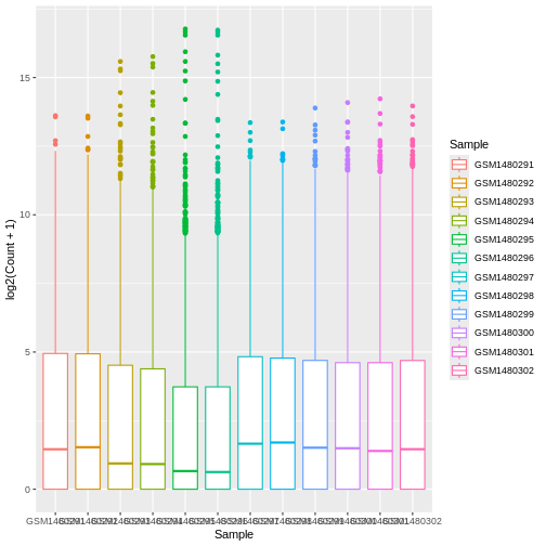
Colouring by categories
Let’s add a different colour for each sample.
Your turn 4.5
View the help file for geom_boxplot and scroll down to
Aesthetics heading. It specifies that there is an
option for colour.
Your turn 4.6
Map each sample to a colour using the colour = argument.
As we are mapping colour to a column in our data we need to put this
inside aes().
R
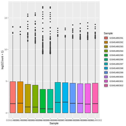
ggplot(data = allinfo, mapping = aes(x = Sample, y = log2(Count + 1), colour = Sample)) +
  geom_boxplot()
Colouring the edges wasn’t quite what we had in mind. Look at the
help for geom_boxplot to see what other aesthetic we could
use. Let’s try fill = instead.
Your turn 4.7
Map each sample to a colour using the fill =
argument.
R
ggplot(data = allinfo, mapping = aes(x = Sample, y = log2(Count + 1), fill = Sample)) +
  geom_boxplot()
That looks better. fill = is used to fill in areas in
ggplot2 plots, whereas colour = is used to colour lines and
points.
A really nice feature about ggplot is that we can easily colour by
another variable by simply changing the column we give to
fill =.
Creating subplots for each gene using faceting
With ggplot we can easily make subplots using faceting. For example we can make stripcharts. These are a type of scatterplot and are useful when there are a small number of samples (when there are not too many points to visualise). Here we will make stripcharts plotting expression by the groups (basal virgin, basal pregnant, basal lactating, luminal virgin, luminal pregnant, luminal lactating) for each gene.
Shorter category names
As we saw in question 5.5, our column names are quite long, and this
might make them difficult to visualise on a plot. We can use the
function mutate() to add another column to our
allinfo object with shorter group names.
Your turn 4.8
Make a new column in allinfo with shortened category
names using the below code. How has the object allinfo
changed?
R
allinfo <- mutate(allinfo, Group = case_when(
        str_detect(characteristics, "basal.*virgin") ~  "bvirg",
        str_detect(characteristics, "basal.*preg")  ~  "bpreg",
        str_detect(characteristics, "basal.*lact")  ~  "blact",
        str_detect(characteristics, "luminal.*virgin")  ~  "lvirg",
        str_detect(characteristics, "luminal.*preg")  ~  "lpreg",
        str_detect(characteristics, "luminal.*lact")  ~  "llact"
       ))
Note: While not covered in this workshop, the above code uses regular expressions to match patterns of characters in a string.
R
head(allinfo)
OUTPUT
# A tibble: 6 × 8
  gene_id            gene_symbol Sample    Count characteristics immunophenotype
  <chr>              <chr>       <chr>     <dbl> <chr>           <chr>
1 ENSMUSG00000000001 Gnai3       GSM14802… 243.  mammary gland,… luminal cell p…
2 ENSMUSG00000000001 Gnai3       GSM14802… 256.  mammary gland,… luminal cell p…
3 ENSMUSG00000000001 Gnai3       GSM14802… 240.  mammary gland,… luminal cell p…
4 ENSMUSG00000000001 Gnai3       GSM14802… 217.  mammary gland,… luminal cell p…
5 ENSMUSG00000000001 Gnai3       GSM14802…  84.7 mammary gland,… luminal cell p…
6 ENSMUSG00000000001 Gnai3       GSM14802…  84.6 mammary gland,… luminal cell p…
# ℹ 2 more variables: `developmental stage` <chr>, Group <chr>
We observe a new column called Group at the end which
has shortened category names, bvirg, lpreg, etc.
Filter for genes of interest
Your turn 4.9
How many genes are there in our data?
R
dim(counts)
OUTPUT
[1] 23735 14There are 23735 rows in our original counts data, so we have data on
23735 different genes. Note: we didn’t run dim() on our
allinfo object because this has multiple rows per gene.
Like our data set, most RNA-seq data sets have information on thousands of genes, but most of them are usually not very interesting, so we may want to filter them.
Here, we choose 8 genes with the highest counts summed across all samples. They are listed here.
Your turn 4.10
Create an object with a list of the 8 most highly expressed genes
R
mygenes <- c("Csn1s2a", "Csn1s1", "Csn2", "Glycam1", "COX1", "Trf", "Wap", "Eef1a1")
We filter our data for just these genes of interest. We use
%in% to check if a value is in a set of values.
Filter the counts data to only include genes in the
mygenes object
R
mygenes_counts <- filter(allinfo, gene_symbol %in% mygenes)
Your turn 4.11
Can you figure out how many rows mygenes_counts will
have without inspecting the object? Print the dimensions of the object
to check if you’re right.
There is one row per sample per gene in mygenes_counts
(as is the case in allinfo). As there are 8 genes left
after filtering, and 12 samples in our data, we expect there to be 96
rows in mygenes_counts.
R
# We expect there to be 8 x 12 rows in mygenes_counts
8 * 12
OUTPUT
[1] 96R
# That is correct!
dim(mygenes_counts)
OUTPUT
[1] 96 8To identify these 8 genes, we used pipes (%>%)
to string a series of function calls together (which is beyond the scope
of this tutorial, but totally worth learning about independently!).
mygenes <- allinfo %>%
  group_by(gene_symbol) %>%
  summarise(Total_count = sum(Count)) %>%
  arrange(desc(Total_count)) %>%
  head(n = 8) %>%
  pull(gene_symbol)
Faceting
Your turn 4.12
Make boxplots faceted by gene, grouped and coloured by groups
R
ggplot(data = mygenes_counts,
       mapping = aes(x = Group, y = log2(Count + 1), fill = Group)) +
  geom_boxplot() +
  facet_wrap(~ gene_symbol)
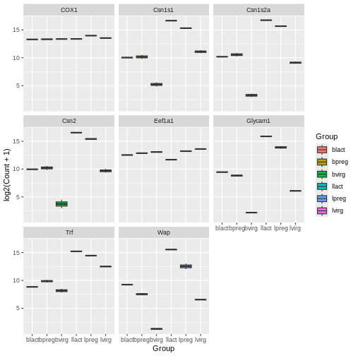
Here we facet on the gene_symbol column using
facet_wrap(). We add the tilde symbol ~ in
front of the column we want to facet on.
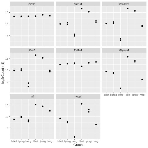
Scatterplots
In the example over, boxplots are not suitable because we only have
two values per group. Let’s plot the individual points instead using the
geom_point() to make a scatter plot.
Your turn 4.13
Make scatter plots faceted by gene and grouped by groups
R
ggplot(data = mygenes_counts, mapping = aes(x = Group, y = log2(Count + 1))) +
  geom_point() +
  facet_wrap(~ gene_symbol)
Jitter plot
In the previous plots, the points are overlapping which makes it hard
to see them. We can make a jitter plot using geom_jitter()
which adds a small amount of random variation to the location of each
point so they do not overlap. If is also quite common to combine jitter
plots with other types of plot, for example, jitter
with boxplot.
Your turn 4.14
Make jitter plots faceted by gene and grouped by groups
R
ggplot(data = mygenes_counts, mapping = aes(x = Group, y = log2(Count + 1))) +
  geom_jitter() +
  facet_wrap(~ gene_symbol)

Your turn 4.15
Modify the code above to colour the jitter plots by group
R
ggplot(data = mygenes_counts,
       mapping = aes(x = Group, y = log2(Count + 1), colour = Group)) +
  geom_jitter() +
  facet_wrap(~ gene_symbol)
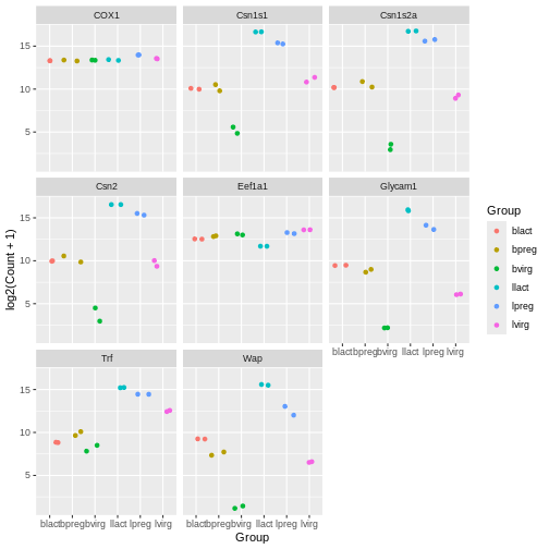
Note that for jitter plots you will want to use the
colour = slot rather than the fill = slot.
Key Points
- A ggplot has 3 components: data (dataset), mapping (columns to plot)
and geom (type of plot). Different types of plots include
geom_point(),geom_jitter(),geom_line(),geom_boxplot(),geom_violin(). -
facet_wrap()can be used to make subplots of the data - The aesthetics of a ggplot can be modified, such as colouring by different columns in the dataset