Extra ggplot2 Customisation
Last updated on 2025-07-01 | Edit this page
Estimated time: 20 minutes
Overview
Questions
- How can you add a title and change the axis labels in a ggplot?
Objectives
- Understand how to specify colours of a plot, either manually or by using a predefined palette
- Explore modifying the
theme()function in ggplot to adjust plot aesthetics
This chapter can be skipped if running low on time.
Specifying colours
You might want to control plotting colours. To see what colour names
are available you can type colours(). There is also an R
colours cheatsheet that shows what the colours look like.
R
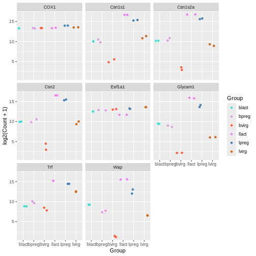
mycolours <- c("turquoise", "plum", "tomato", "violet", "steelblue", "chocolate")
Then we then add these colours to the plot using a + and
scale_colour_manual(values = mycolours).
R
ggplot(data = mygenes_counts,
       mapping = aes(x = Group, y = log2(Count + 1), colour = Group)) +
  geom_jitter() +
  facet_wrap(~ gene_symbol) +
  scale_colour_manual(values = mycolours)
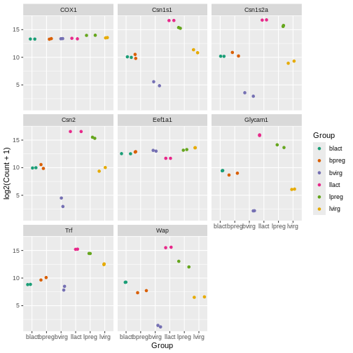
There are built-in colour palettes that can be handy to use, where
the sets of colours are predefined. scale_colour_brewer()
is a popular one (there is also scale_fill_brewer()). You
can take a look at the help for scale_colour_brewer() to
see what palettes are available. The R
colours cheatsheet also shows what the colours of the palettes look
like. There’s one called “Dark2”, let’s have a look at that.
R
ggplot(data = mygenes_counts,
       mapping = aes(x = Group, y = log2(Count + 1), colour = Group)) +
  geom_jitter() +
  facet_wrap(~ gene_symbol) +
  scale_colour_brewer(palette = "Dark2")
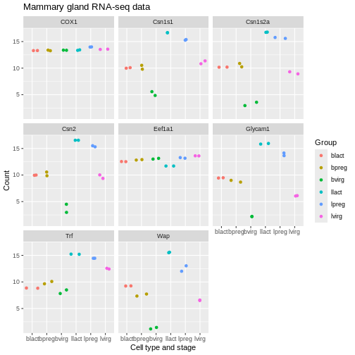
Axis labels and Title
We can change the axis labels and add a title with
labs(). To change the x axis label we use
labs(x = "New name"). To change the y axis label we use
labs(y = "New name") or we can change them all at the same
time.
R
ggplot(data = mygenes_counts,
mapping = aes(x = Group, y = log2(Count + 1), colour = Group)) +
geom_jitter() +
facet_wrap(~ gene_symbol) +
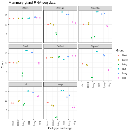
labs(x = "Cell type and stage", y = "Count", title = "Mammary gland RNA-seq data")
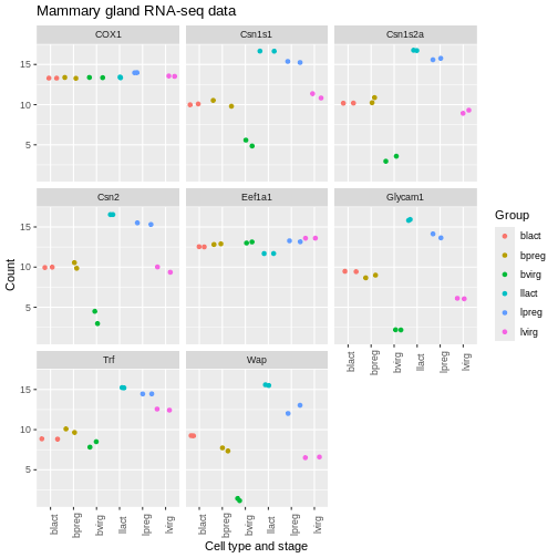
Themes
We can adjust the text on the x axis (the group labels) by turning them 90 degrees so we can read the labels better. To do this we modify the ggplot theme. Themes are the non-data parts of the plot.
R
ggplot(data = mygenes_counts,
       mapping = aes(x = Group, y = log2(Count + 1), colour = Group)) +
  geom_jitter() +
  facet_wrap(~ gene_symbol) +
  labs(x = "Cell type and stage", y = "Count", title = "Mammary gland RNA-seq data") +
  theme(axis.text.x = element_text(angle = 90))
We can remove the grey background and grid lines.
There are also a lot of built-in themes. Let’s have a look at a
couple of the more widely used themes. The default ggplot theme is
theme_grey().
R
ggplot(data = mygenes_counts,
mapping = aes(x = Group, y = log2(Count + 1), colour = Group)) +
geom_jitter() +
facet_wrap(~ gene_symbol) +
labs(x = "Cell type and stage", y = "Count", title = "Mammary gland RNA-seq data") +
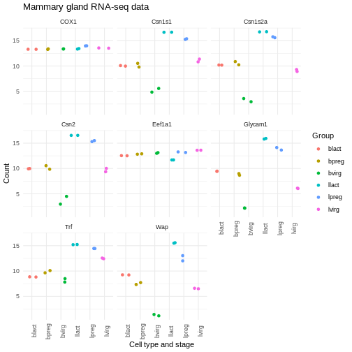
theme_bw() +
theme(axis.text.x = element_text(angle = 90))
R
ggplot(data = mygenes_counts,
mapping = aes(x = Group, y = log2(Count + 1), colour = Group)) +
geom_jitter() +
facet_wrap(~ gene_symbol) +
labs(x = "Cell type and stage", y = "Count", title = "Mammary gland RNA-seq data") +
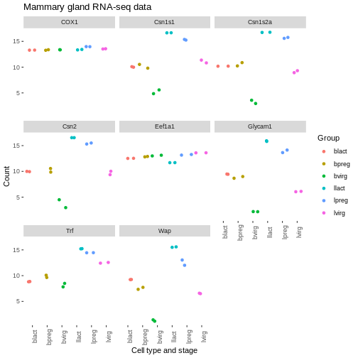
theme_minimal() +
theme(axis.text.x = element_text(angle = 90))
There are many themes available, you can see some in the R graph gallery.
We can also modify parts of the theme individually. We can remove the grey background and grid lines with the code below.
R
ggplot(data = mygenes_counts,
       mapping = aes(x = Group, y = log2(Count + 1), colour = Group)) +
  geom_jitter() +
  facet_wrap(~ gene_symbol) +
  labs(x = "Cell type and stage", y = "Count", title = "Mammary gland RNA-seq data") +
  theme(axis.text.x = element_text(angle = 90)) +
  theme(panel.background = element_blank(),
        panel.grid.major = element_blank(),
        panel.grid.minor = element_blank())
Order of categories
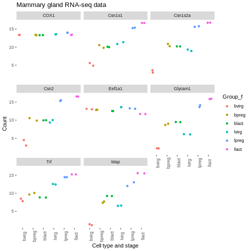
The groups have been plotted in alphabetical order on the x axis and in the legend (that is the default order), however, we may want to change the order. We may prefer to plot the groups in order of stage, for example, basal virgin, basal pregnant, basal lactate, luminal virgin, luminal pregnant, luminal lactate.
First let’s make an object with the group order that we want.
R
group_order <- c("bvirg", "bpreg", "blact", "lvirg", "lpreg", "llact")
Next we need to make a column with the groups into an R data type called a factor. Factors in R are a special data type used to specify categories, you can read more about them in the R for Data Science book. The names of the categories are called the factor levels.
We’ll add another column called “Group_f” where we’ll make the Group column into a factor and specify what order we want the levels of the factor.
R
mygenes_counts <- mutate(mygenes_counts, Group_f = factor(Group, levels = group_order))
Take a look at the data. As the table is quite wide we can use
select() to select just the columns we want to view.
R
select(mygenes_counts, gene_id, Group, Group_f)
OUTPUT
# A tibble: 96 × 3
   gene_id            Group Group_f
   <chr>              <chr> <fct>
 1 ENSMUSG00000000381 lvirg lvirg
 2 ENSMUSG00000000381 lvirg lvirg
 3 ENSMUSG00000000381 lpreg lpreg
 4 ENSMUSG00000000381 lpreg lpreg
 5 ENSMUSG00000000381 llact llact
 6 ENSMUSG00000000381 llact llact
 7 ENSMUSG00000000381 bvirg bvirg
 8 ENSMUSG00000000381 bvirg bvirg
 9 ENSMUSG00000000381 bpreg bpreg
10 ENSMUSG00000000381 bpreg bpreg
# ℹ 86 more rows
Notice that the Group column has <chr> under the
heading, that indicates is a character data type, while the Group_f
column has <fct> under the heading, indicating it is
a factor data type. The str() command that we saw
previously is useful to check the data types in objects.
R
str(mygenes_counts)
OUTPUT
tibble [96 × 9] (S3: tbl_df/tbl/data.frame)
 $ gene_id            : chr [1:96] "ENSMUSG00000000381" "ENSMUSG00000000381" "ENSMUSG00000000381" "ENSMUSG00000000381" ...
 $ gene_symbol        : chr [1:96] "Wap" "Wap" "Wap" "Wap" ...
 $ Sample             : chr [1:96] "GSM1480291" "GSM1480292" "GSM1480293" "GSM1480294" ...
 $ Count              : num [1:96] 90.2 95.6 4140.3 8414.4 49204.9 ...
 $ characteristics    : chr [1:96] "mammary gland, luminal cells, virgin" "mammary gland, luminal cells, virgin" "mammary gland, luminal cells, 18.5 day pregnancy" "mammary gland, luminal cells, 18.5 day pregnancy" ...
 $ immunophenotype    : chr [1:96] "luminal cell population" "luminal cell population" "luminal cell population" "luminal cell population" ...
 $ developmental stage: chr [1:96] "virgin" "virgin" "18.5 day pregnancy" "18.5 day pregnancy" ...
 $ Group              : chr [1:96] "lvirg" "lvirg" "lpreg" "lpreg" ...
 $ Group_f            : Factor w/ 6 levels "bvirg","bpreg",..: 4 4 5 5 6 6 1 1 2 2 ...
str() shows us Group_f column is a Factor with 6 levels
(categories).
We can check the factor levels of a column as below.
R
levels(mygenes_counts$Group_f)
OUTPUT
[1] "bvirg" "bpreg" "blact" "lvirg" "lpreg" "llact"The levels are in the order that we want, so we can now change our
plot to use the “Group_f” column instead of Group column (change
x = and colour =).
R
ggplot(data = mygenes_counts,
       mapping = aes(x = Group_f, y = log2(Count + 1), colour = Group_f)) +
  geom_jitter() +
  facet_wrap(~ gene_symbol) +
  labs(x = "Cell type and stage", y = "Count", title = "Mammary gland RNA-seq data") +
  theme(axis.text.x = element_text(angle = 90)) +
  theme(panel.background = element_blank(),
        panel.grid.major = element_blank(),
        panel.grid.minor = element_blank())
We could do similar if we wanted to have the genes in the facets in a different order. For example, we could add another column called “gene_symbol_f” where we make the gene_symbol column into a factor, specifying the order of the levels.
Exercise
Make a colourblind-friendly plot using the colourblind-friendly palettes here.
Key Points
- In
ggplot2, you can specify colours manually using thescale_colour_manual()function or use a predefined palette using thescale_colour_brewer()function - The
labs()function allows you to set a plot title and change axis labels - Complete themes such as
theme_bw()andtheme_classic()can be used to change the appearance of a plot - Using the
theme()function allows you to tweak components of a theme