Summary and exercise
Last updated on 2025-11-10 | Edit this page
Overview
Questions
- How can we summarise the key steps in an RNA-seq differential expression workflow?
- When should we use limma-trend versus limma-voom?
- How can we visualise and interpret DE results?
- What plots help communicate DE findings effectively?
- Where can we find RNA-seq count data to practise these analyses?
Objectives
- Consolidate the complete RNA-seq DE workflow from filtering to visualisation.
- Apply both limma-trend and limma-voom to new comparisons independently.
- Generate and interpret volcano, MD, and heatmap plots.
- Recognise reliable sources for public RNA-seq count data.
- Gain confidence reproducing and extending DE analyses.
Let’s summarise by putting the key analysis code together with comments (for the RA vs WT comparison). Here’s the preliminaries etc.:
R
# organise data into a DGEList
tab <- read.table("data/GSE232852_CountsTable.txt", header=TRUE)

annotation <- tab[,c(1,2)]
counts <- tab[,-c(1,2)]

dge <- DGEList(counts=counts, genes=annotation)

# sample info and group vector
samples <- colnames(tab)[-c(1,2)]
group <- c(rep("RA",3), rep("TGFb",3), rep("RA_TGFb",3), rep("WT",3))
info <- data.frame(samples, group)

group <- factor(info$group)

# filter for low expression
i <- filterByExpr(dge, group=group)
dge <- dge[i,,keep.lib.size=FALSE]

# check library sizes
lib.size.millons <- colSums(dge$counts) / 1e6
barplot(lib.size.millons, las=2, cex.names=0.8, main="Library size (millons)")
abline(h=20, lwd=2, col="red2")

# visualisation: raw data
y <- log2(dge$counts + 1/2)

pca <- prcomp(t(y), center=TRUE)
autoplot(pca, data.frame(group=group), col='group', size=4) +
  theme_classic() +
  ggtitle("PCA plot")

cols.group <- group
levels(cols.group) <- hue_pal()(4)
boxplot(y, col=as.character(cols.group), outline=FALSE, las=2, cex.axis=0.7, main="Boxplots")
RLE <- y - rowMedians(y)
boxplot(RLE, col=as.character(cols.group), outline=FALSE, las=2, cex.axis=0.7, main="RLE plot")
abline(h=0, col="grey20", lwd=3, lty=1)

# normalise for library size and composition
dge <- calcNormFactors(dge, method="TMM")
y <- cpm(dge, log=TRUE)

# visualisation: normalised data
pca <- prcomp(t(y), center=TRUE)
autoplot(pca, data.frame(group=group), col='group', size=4) +
  theme_classic() +
  ggtitle("PCA plot")

cols.group <- group
levels(cols.group) <- hue_pal()(4)
boxplot(y, col=as.character(cols.group), outline=FALSE, las=2, cex.axis=0.5, main="Boxplots")
RLE <- y - rowMedians(y)
boxplot(RLE, col=as.character(cols.group), outline=FALSE, las=2, cex.axis=0.5, main="RLE plot")
abline(h=0, col="grey20", lwd=3, lty=1)
If the library sizes aren’t too different, we proceed with
limma-trend:
R
# organise EList
y <- new("EList")
y$E <- cpm(dge, log=TRUE)
y$genes <- dge$genes

# design matrix
X <- model.matrix(~0 + group)
colnames(X) <- levels(group)

# fit linear model (to get group means)
fit <- lmFit(y, design=X)

# make contrasts
CM <- makeContrasts(
  RA_WT   = RA - WT,
  TGFb_WT = TGFb - WT,
  levels=X)

# fit contrasts
fit2 <- contrasts.fit(fit, contrasts=CM)

# test for DE
fit2 <- eBayes(fit2, trend=TRUE)

# some checks
dt <- decideTests(fit2)
plotSA(fit2) # SA plot
plotMD(fit2, coef="RA_WT", status=dt[,"RA_WT"], cex=0.6, main="MD-plot: RA vs WT") # MD plot
abline(h=0, lwd=2, col="green2")
hist(fit2$p.value[,"RA_WT"], col="grey", xlab="p-value", main="p-value histogram: RA vs WT") # p-value hist

# DE results
tab <- topTable(fit2, coef="RA_WT", n=Inf)
write.xlsx(tab, file="../Results/DE_limma-trend_RA-vs-WT.xlsx")
If the library sizes are very different, proceed with
limma-voom:
R
# organise voom EList
v <- voom(dge, design=X, plot=TRUE) # same X as above

# fit linear model (to get group means)
fit.voom <- lmFit(v, design=X)

# fit contrasts
fit2.voom <- contrasts.fit(fit.voom, contrasts=CM) # same CM as above

# test for DE
fit2.voom <- eBayes(fit2.voom, trend=FALSE) # NOTE: trend=FALSE

# some checks
dt <- decideTests(fit2.voom)
plotMD(fit2.voom, coef="RA_WT", status=dt[,"RA_WT"], cex=0.6, main="MD-plot: RA vs WT") # MD plot
abline(h=0, lwd=2, col="green2")
hist(fit2$p.value[,"RA_WT"], col="grey", xlab="p-value", main="p-value histogram: RA vs WT") # p-value hist

# DE results
tab <- topTable(fit2.voom, coef="RA_WT", n=Inf)
write.xlsx(tab, file="../Results/DE_limma-voom_RA-vs-WT.xlsx")
To reinforce what you’ve learnt, try your hand at finding DE results for the RA+TGFb vs WT comparison using both limma approaches.
Solution:
R
# new contrast matrix
CM2 <- makeContrasts(
  RA_WT      = RA - WT,
  TGFb_WT    = TGFb - WT,
  RA.TGFb_WT = RA_TGFb - WT, # new comparison
  levels=X)

# limma-trend
fit2 <- contrasts.fit(fit, contrasts=CM2)
fit2 <- eBayes(fit2, trend=TRUE)

dt <- decideTests(fit2)
summary(dt)

tab <- topTable(fit2, coef="RA.TGFb_WT", n=Inf)
write.xlsx(tab, file="../Results/DE_limma-trend_RA.TGFb_WT.xlsx")

# limma-voom
fit2.voom <- contrasts.fit(fit.voom, contrasts=CM2)
fit2.voom <- eBayes(fit2.voom, trend=FALSE)

dt <- decideTests(fit2.voom)
summary(dt)

tab <- topTable(fit2.voom, coef="RA.TGFb_WT", n=Inf)
write.xlsx(tab, file="../Results/DE_limma-voom_RA.TGFb_WT.xlsx")
Visualisation of results
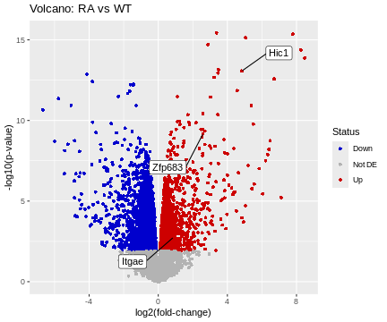
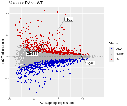
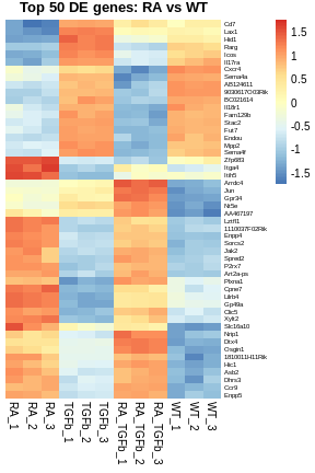
There are several common ways to visualise DE results, e.g. volcano plots, MD plots (already used for checking above but made nicer here), and heatmaps. Let’s produce basic examples of each, for the RA vs WT comparison.
R
# organize data frame for volcano and MD plots
tab <- topTable(fit2, coef="RA_WT", n=Inf)
logFC <- tab$logFC
p.value <- tab$P.Value
A <- tab$AveExpr
Gene <- tab$Symbol

Status <- rep("Not DE", nrow(tab))
Status[tab$logFC>0 & tab$adj.P.Val<0.05] <- "Up"
Status[tab$logFC<0 & tab$adj.P.Val<0.05] <- "Down" # table(Status)

df <- data.frame(logFC, p.value, A, Gene, Status)

# prepare some annotation
genes <- c("Hic1","Itgae","Zfp683")
i <- match(genes, df$Gene)
HL <- df[i,]

# basic volcano plot
ggplot(data=df, aes(x=logFC, y=-log10(p.value))) +
  geom_point(shape=16, aes(color=Status)) +
  scale_color_manual(values=c("blue3","grey70","red3")) +
  geom_label_repel(data=HL, aes(label=Gene), box.padding=2) +
  labs(title="Volcano: RA vs WT", x="log2(fold-change)", y="-log10(p-value)")
R
# basic MD plot
ggplot(data=df, aes(x=A, y=logFC)) +
  geom_point(shape=16, aes(color=Status)) +
  scale_color_manual(values=c("blue3","grey70","red3")) +
  geom_hline(yintercept=0, linetype=2, colour="black") +
  geom_label_repel(data=HL, aes(label=Gene), box.padding=2) +
  labs(title="Volcano: RA vs WT", x="Average log-expression", y="log2(fold-change)")
R
# organize data frame for heatmap
top.genes <- tab[1:50,]$Symbol
df <- y$E
rownames(df) <- y$genes$Symbol
df <- df[top.genes,]

# basic heatmap
pheatmap(
  df,
  border_color=NA,
  scale="row",
  cluster_rows=TRUE,
  cluster_cols=FALSE,
  treeheight_row=0,
  main="Top 50 DE genes: RA vs WT",
  fontsize_row=6)
Getting data
Now that you have some basic analysis skills, you’ll want to get your hands on some data, e.g. publicly available RNA-seq counts tables. As we’ve seen, one place to get data is Gene Expression Omnibus (GEO). But, GEO can be hit-and-miss: sometimes counts tables are available as supplementary files (as we saw), but sometimes they’re not. Although, sometimes there are other ways of getting counts tables on GEO. It’s really a bit of a mess—you just need to get on there and try your luck.
Thankfully, there are alternatives. For example, for human and mouse data, GREIN is a real gem: its search interface is clear and simple to use and the counts data and sample information is uniformly pre-packaged and ready for easy download. Check it out.
And have fun!
- The full DE workflow combines filtering, normalisation, modelling, and testing.
- limma-trend and limma-voom differ mainly in handling library size variability.
- Visualisations such as volcano plots, MD plots, and heatmaps summarise DE results clearly.
- Public repositories like GEO and GREIN provide accessible RNA-seq count data.
- Mastering reproducible code structure ensures robust and transparent RNA-seq analysis.