Introduction to R
Last updated on 2025-07-01 | Edit this page
Authors: Maria Doyle, Jessica Chung, Vicky Perreau, Kim-Anh Lê Cao, Saritha Kodikara, Eva Hamrud.
Overview
Questions
- Why might you prefer to run code in a script rather than directly from the console?
- What is the assignment operator and how can you use it to store objects?
Objectives
- Introduce the R programming language and RStudio
- Explain functions, objects, and packages
- Demonstrate how to view help pages and documentation
R for Biologists course
R takes time to learn, like a spoken language. No one can expect to be an R expert after learning R for a few hours. This course has been designed to introduce biologists to R, showing some basics, and also some powerful things R can do (things that would be more difficult to do with Excel). The aim is to give beginners the confidence to continue learning R, so the focus here is on tidyverse and visualisation of biological data, as we believe this is a productive and engaging way to start learning R. After this short introduction you could use this book to dive a bit deeper.
Most R programmers do not remember all the command lines we share in this document. R is a language that is continuously evolving. They use Google extensively to use many new tricks. Do not hesitate to do the same!
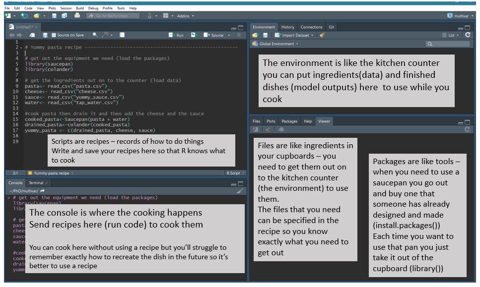
Intro to R and RStudio
RStudio is an interface that makes it easier to use R. There are four panels in RStudio. The screenshot below shows an analogy linking the different RStudio panels to cooking.
R script vs console
There are two ways to work in RStudio in the console or in a script.
Let’s start by running a command in the console.
Your turn 1.1
Run the command below in the console.
R
1 + 1
Once you’ve typed in the command into your console, just press enter. The output should be printed into the console.
Alternatively, we can use an R script. An R script allows us to have a record (recipe) of what we have done, whilst commands we type into the console are not saved. Keeping a record speeds up our analysis because we can re-use code, its also helpful to remember what we have done before!
Your turn 1.2
Create a script from the top menu in RStudio:File > New File > R Script, then type the command
below in your new script.
R
2 + 2
To run a command in a script, we place the cursor on the line you want to run, and then either:
- Click on the
runbutton on top of the panel - Use Ctrl + Enter (Windows/Linux) or Cmd + Enter (MacOS).
You can also highlight multiple lines at once and run them at once - have a go!
Recommended Practice: Use Scripts
The console is great for quick tests or running single lines of code. However, for more complex analyses, using scripts is best practice. Scripts help keep your work organized and reproducible. We’ll use scripts for the rest of this workshop.
Commenting
Comments are notes to ourself or others about the commands in the
script. They are useful also when you share code with others. Comments
start with a # which tells R not to run them as
commands.
R
# testing R
2 + 2
Keeping an accurate record of how you have manipulated your data is important for reproducible research. Writing detailed comments and documenting your work are useful reminders to your future self (and anyone else reading your scripts) on what your code does.
Commenting code is good practice, why not try commenting on the code you write in this session to get into the habit, it will also make your R script more informative when you come back to it in the future.
Working directory
Opening an RStudio session launches it from a specific location. This is the ‘working directory’.
Understanding the Working Directory
The working directory is the folder where R reads and saves files on your computer. When working in R, you’ll often read data files and write outputs like analysis results or plots. Knowing where your working directory is set helps ensure R finds your files and saves outputs in the right place.
You can find out where your current working directory is set to by using two different approaches:
- Run the command
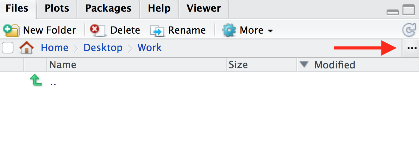
getwd(). This will print out the path to your working directory in the console. It will be in this format:/path/to/working/directory(Mac) orC:\path\to\working\directory(Windows), or - In the bottom-right panel, click the blue cog icon on the menu at
the top, then click
Go To Working Directory. This will show you the location and files in your working directory in the files window.
Your turn 1.3
Where is you working directory set to at the moment? Is this a useful place to have it set?
By default the working directory is often your home directory. To keep data and scripts organised its good practice to set your working directory as a specific folder.
Your turn 1.4
Create a folder for this course somewhere on your computer. Name the
folder something meaningful, for example, intro_r_course or
Introduction_to_R. Then, to set this folder as your working
directory, you can do this in multiple ways, e.g.:
- Click in the menu at the top on
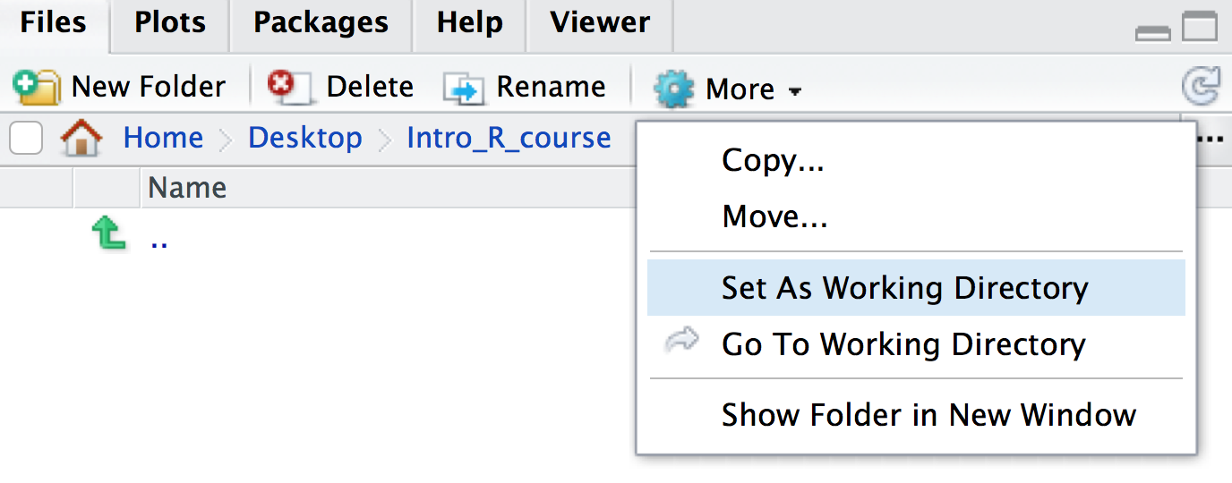
Session > Set Working Directory > Choose directoryand choose your folder, or - In the bottom-right panel, navigate to the folder that you want to
be your working directory. You can also do this by clicking on the three
dots icon on the top-right of the panel. Then once you’re in a suitable
directory, in the menu bar of the in the bottom-right panel, navigate to
the blue cog icon and click
Set As Working Directory
You will see that once you have set your working directory, the files inside your new folder will appear in the ‘Files’ window on RStudio.
Your turn 1.5
Save the script you created in the previous section as
intro.R in this directory. You can do this by clicking on
File > Save and the default location should be the
current working directory (e.g. intro_r_course).
Multiple Ways to Achieve the Same Goal in R
You might have noticed by now that in R, there are often several ways to accomplish the same task. You might find one method more intuitive or easier to use than others — and that’s okay! Experiment, explore, and choose the approach that works best for you.
You might have noticed that when you set your working directory in
the previous step, a line appeared in your console saying something like
setwd("~/Desktop/intro_r_course"). As well as the
point-and-click methods described above, you can also set your working
directory using the setwd() command in the console or in a
script.
Your turn 1.6
What might be an advantage of using the command line option
(i.e. setwd()) over point-and-click methods to set your
working directory?
There is no easy way to record what you point and click on (unless you write it all down!). Putting a command at the top of the script means you are less likely to forget where you have your working directory, and when you come back to it another day you can quickly re-run it.
Your turn 1.6 (continued)
Add a line at the top of your newly created script
intro.R so that the working directory is set to your newly
made folder (e.g. intro_r_course).
You can also use RStudio projects as described here to automatically keep track of and set the working directory.
Functions
In mathematics, a function defines a relation between inputs and output. In R (and other coding languages) it is the same. A function (also called a command) takes inputs called arguments inside parentheses, and output some results.
We have actually already used two functions in this workshop -
getwd() and setwd(). getwd() does
not take an input, but outputs your working directory.
setwd() takes a path as its input, and sets it as your
working directory.
Let’s take a look at some more functions below.
Your turn 1.7
Compare these two outputs. In the second line we use the function
sum().
R
2 + 2
sum(2, 2)
Your turn 1.8
Try using the below function with different inputs, what does it do?
R
sqrt(9)
sqrt(81)
Tab completion
A very useful feature is Tab completion. You can start typing and use Tab to autocomplete code, for example, a function name.
Objects
It is useful to store data or results so that we can use them later
on for other parts of the analysis. To do this, we can store data as
objects. We can use the assignment operator
<-, where the name of the object (which are called
variables) is on the left side of the arrow, and the
data you want to store is on the right side.
For example, the below code assigns the number 5 to the
object x using the <- operator. You can
print out what the x object is by just typing it into the
console or running it in your script.
Your turn 1.9
Play around and create some objects. Then print out the objects using their names.
R
x <- 5
x

result_1 <- 2 + 2
result_1
Assignment operator shortcut
In RStudio, typing Alt + - (holding down
Alt at the same time as the - key) will write
<- in a single keystroke in Windows, while typing >
Option + - (holding down Option at the
same time as the - key) does the same in a Mac.
Once you have assigned objects, you can perform manipulations on them using functions.
Your turn 1.10
Compare the two outputs.
R
sum(1, 2)

x <- 1
y <- 2
sum(x, y)
Remember, if you use the same object name multiple times, R will overwrite the previous object you had created.
Your turn 1.11
What is the value of x after running this code?
R
x <- 5
x <- 10
x is 10. The previous value of 5 has been
overwritten.
Your turn 1.12
Can you write some code to calculate the sum of the square root of 9 and the square root of 16?
R
sum(sqrt(9), sqrt(16))
OUTPUT
[1] 7Recommended Practice: Name your objects with care
Use clear and descriptive names for your objects, such as
data_raw and data_normalised, instead of vague
names like data1 and data2. This makes it
easier to track different steps in your analysis.
So far we have looked at objects which are numbers. However objects
can also be made of characters, these are called strings. To
create a string you need to use quotation marks "".
R
my_string <- "Hello!"
my_string
OUTPUT
[1] "Hello!"There are a whole host of different objects you can make in R, too
many to cover in this session! Later on when we do some data wrangling
we will work with objects which are dataframes (i.e. tables)
and vectors (a series of numbers and/or strings). Let’s make a
simple vector now to get familiar. To make a vector you need to use the
command c().
R
my_vector <- c(1, 2, 3)
my_vector
OUTPUT
[1] 1 2 3R
my_new_vector <- c("Hello", "World")
my_new_vector
OUTPUT
[1] "Hello" "World"Your turn 1.13
Try making an object and setting it as 1:5, what does
this object look like?
R
x <- 1:5
x
OUTPUT
[1] 1 2 3 4 51:5 creates a vector with a sequence of numbers from 1
to 5.
Once you have a vector, you can subset it. We will cover this further when we do some data wrangling but lets try a simple example here.
R
my_vector <- c("A", "B", "C")
# extract the first element from the vector
my_vector[1]
OUTPUT
[1] "A"R
# extract the last element from the vector
my_vector[3]
OUTPUT
[1] "C"Your turn 1.14
Create a vector from 1 to 10 and print the 9th element of the vector.
R
my_vector <- 1:10
my_vector[9]
OUTPUT
[1] 9Packages
We have seen that functions are really useful tools which can be used
to manipulate data. Although some basic functions, like
sum() and setwd() are available by default
when you install R, some more exciting functions are not. There are
thousands of R functions available for you to use, and functions are
organised into groups called packages or libraries. An
R package contains a collection of functions (usually that perform
related tasks), as well as documentation to explain how to use the
functions. Packages are made by R developers who wish to share their
methods with others.
Once we have identified a package we want to use, we can install and
load it so we can use it. Here we will use the tidyverse
package which includes lots of useful functions for data managing, we
will use the package later in this session.
If it’s not already installed on your computer, you can use the
install.packages function to install a
package. A package is a collection of functions along
with documentation, code, tests and example data.
R
install.packages("tidyverse")
Packages in the CRAN or Bioconductor
Packages are hosted in different locations. Packages hosted on CRAN (stands for Comprehensive R Archive Network) are often generic package for all sorts of data and analysis. Bioconductor is an ecosystem that hosts packages specifically dedicated to biological data.
The installation of packages from Bioconductor is a bit different,
e.g to install the mixOmics package we type:
R
# You don't need to run this codeblock for this workshop

if (!require("BiocManager", quietly = TRUE))
    install.packages("BiocManager")

BiocManager::install("mixOmics")
You don’t need to remember this command line, as it is featured in the Bioconductor package page (see here for example).
One advantage of Bioconductor packages is that they are well documented, updated and maintained every six months.
Getting help
As described above, every R package includes documentation to explain
how to use functions. For example, to find out what a function in R
does, type a ? before the name and help information will
appear in the Help panel on the right in RStudio.
Your turn 1.15
Find out what the sum() command does.
R
?sum
What is really important is to scroll down the examples to understand how the function can be used in practice. You can use this command line to run the examples:
Your turn 1.16
Run some examples of the sum() command.
R
example(sum)
Packages also come with more comprehensive documentation called vignettes. These are really helpful to get you started with the package and identify which functions you might want to use.
Your turn 1.17
Have a look at the tidyverse package vignette.
R
browseVignettes("tidyverse")
Common R errors
R error messages are common and often cryptic. You most likely will encounter at least one error message during this tutorial. Some common reasons for errors are:
- Case sensitivity. In R, as in other programming languages, case
sensitivity is important.
?install.packagesis different to?Install.packages. - Missing commas
- Mismatched parentheses or brackets or unclosed parentheses, brackets or apostrophes
- Not quoting file paths (
"") - When a command line is unfinished, the “+” in the console will indicate it is awaiting further instructions. Press ESC to cancel the command.
To see examples of some R error messages with explanations see here
More information for when you get stuck
As well as using package vignettes and documentation, Google and Stack Overflow are also useful resources for getting help.
Key Points
- Use scripts for analyses over typing commands in the console. This allows you to keep an accurate record of what you did, which is important for reproducible research
- You can store data as objects using the assignment operator
<- - Installing packages from CRAN is done with the
install.packages()function - You can view the help page of a function by typing a
?before the name (e.g.?sum)